
Bite App
Product Designer
Project Overview
As someone who has over a decade of experience in dentistry, I understand the needs in this space on a very personal level. I leveraged my knowledge and experience to create a patient advocacy tool that comes from a place of understanding and genuine empathy.


User Problem: The absence of a dedicated patient advocacy tool contributes to a communication gap between dental practitioners and their patients, hindering the establishment of a collaborative and informed partnership.
Business Challenge: How can we create a platform that keeps users engaged, increases case acceptance, and maintains and grows the overall patient base?
Design Solution: To create a platform where patients can have optimized dental visits and a greater understanding of their appointments, thus maintaining patient retention and treatment plan acceptance.
Project Timeline
Week 1
Empathize
Competitor Analysis
Secondary Research
User Interviews
Define
Affinity Mapping
Behavioral Archetypes
Synthesizing Research
Week 2
Ideate
Sitemap
User Flows
Design
Branding
Wireframes
High-fidelity Mockups
Week 3
Test & Refine
Prototype Testing
Iterating on Designs
Understanding the current state of dental apps…
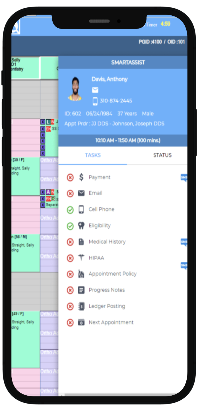
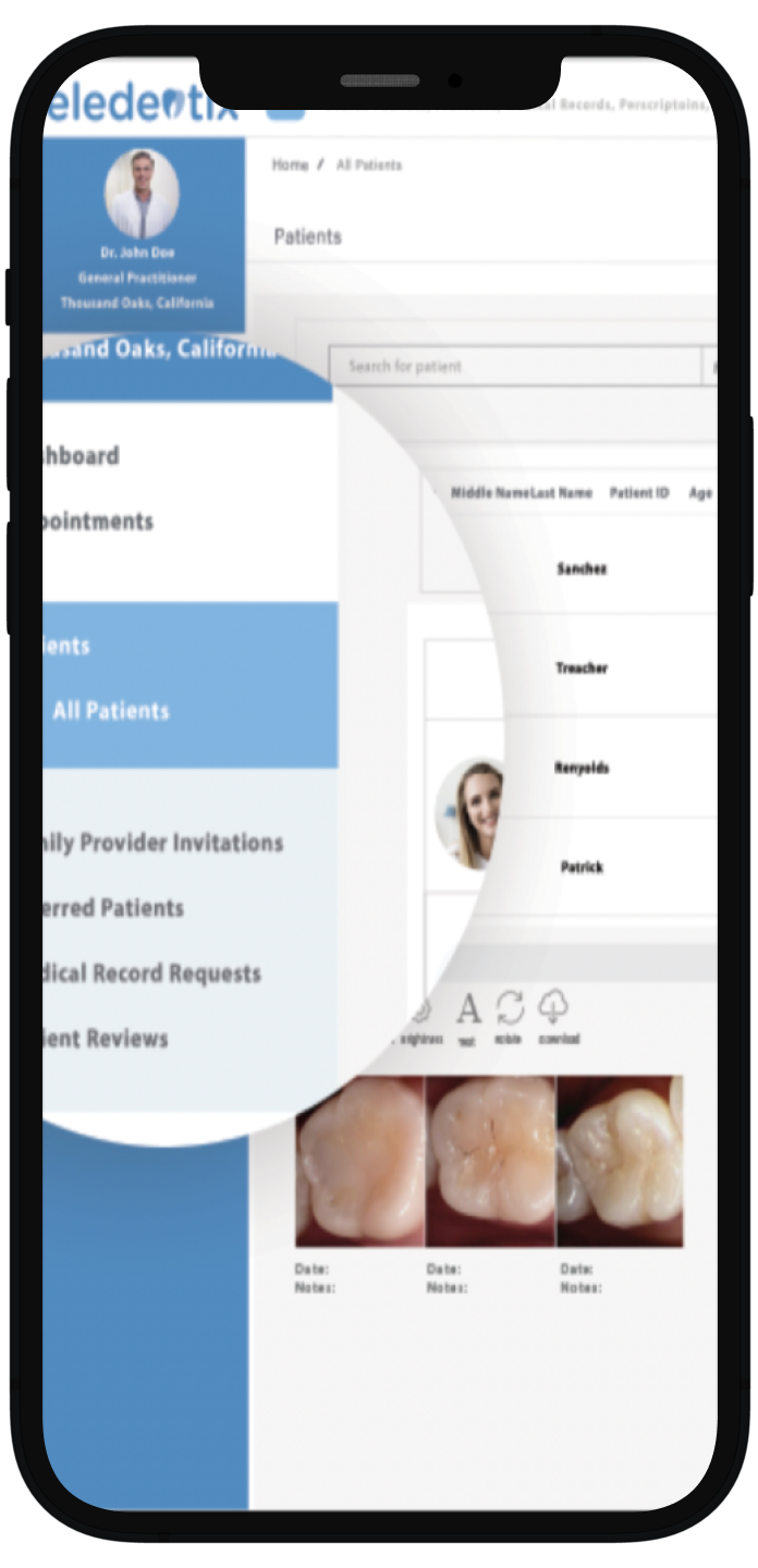
The first step was to analyze competitors of dental platforms. I found that the first set of platforms focused on practice management and very few were patient-focused. My second analysis focused on more patient-oriented platforms; the insights are detailed below.
Zuub
Plans replace complicated codes with patient-friendly procedure names and descriptions
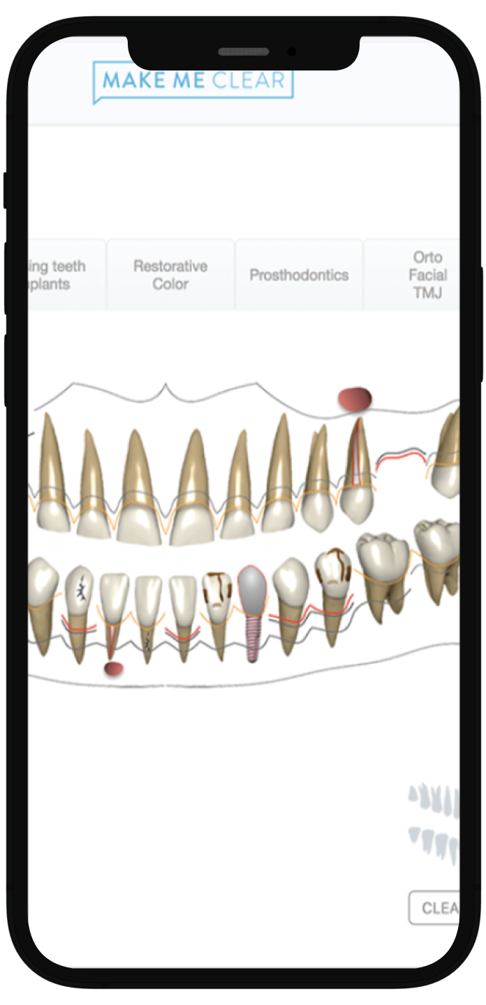
Makemeclear
Customizable final report with images, xrays, photos, etc to show final result and value to the patient
Planet DDS
Online patient portal where they can book their own appointments, fill online forms, etc.
Teledentix
Patient education materials in the portal given by the provider
Conducting user interviews
The dental visit for some can start even before they leave the door with crippling anxiety and for others, the dental visit doesn’t have any impact until they get the bill.
Structuring the interview by asking before, during, and after the dental visit provided insight into where there were the most strengths and weaknesses for the users and why.
Affinity mapping the user research findings
An affinity map helped me organize all of the most important interview points to one location and discover patterns including what is lacking in the dental app space, what is important to users, and what are deal breakers.
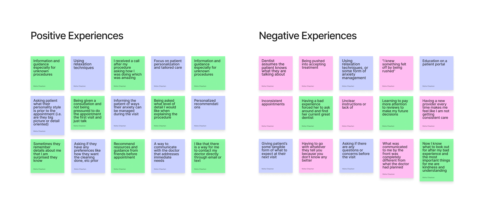
Synthesizing findings from the user research
From the empathy map, I was able to group the positive and negative experiences users had at the dentist. I aimed to emphasize the ways in which users can have a pleasant experience during their dental visits, as opposed to an adverse one. My focus was to create designs that contributed to an approachable atmosphere for patients, and to promote a shift from potential anxiety and apprehension to a sense of ease and comfort.
Great experiences at the dentist
Effective and open communication
Transparency
Being able to voice concerns
Consistency with quality of care
Flexibility
Patience
Unpleasant dental visits
Inconsistencies in the office with staff, treating doctor, treatment expectations
Not understanding a procedure
Pushiness
The feeling of being taken advantage of
Lack of personalized care
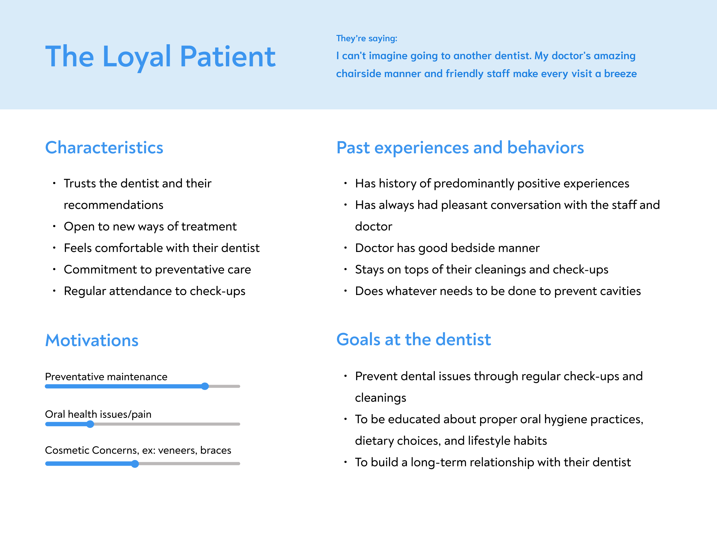
Creating behavioral archetypes from the research
Creating behavioral archetypes was a crucial step for me in understanding and empathizing with the end users of the product. By delving into the psychology and behaviors of users, I was able to build a more user-centric and intuitive design that resonates with their preferences, motivations, and pain points.
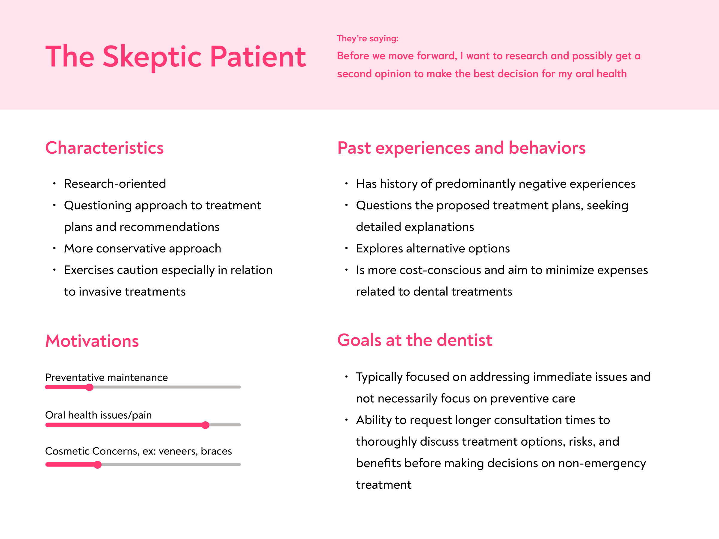
Defining the problem with how might we questions
By understanding these archetypes, I was able to formulate "How might we?" questions that directly address the unique needs and preferences of each archetype.
How might we….
Make users feel that they are making decision about their healthcare with confidence?
Decrease anxiety and fear associated with going to the dentist?
Create a platform that will make the dental visit more approachable and understandable?
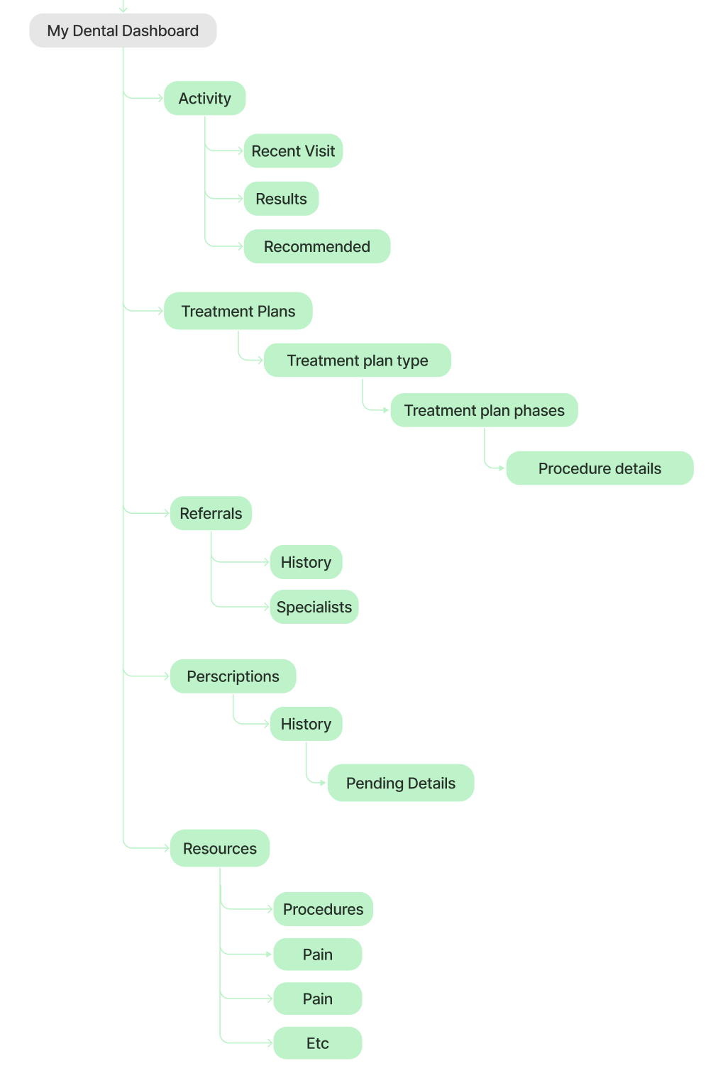
Creating an information architecture
Now that the user and target base was understood I was ready to create the structure for this platform. Creating a sitemap was important because it provided organization for all ideas and sections and it also provided architectural hierarchy which helped me focus on which pages to prioritize and which pages would house information that I didn’t necessarily have to design for.
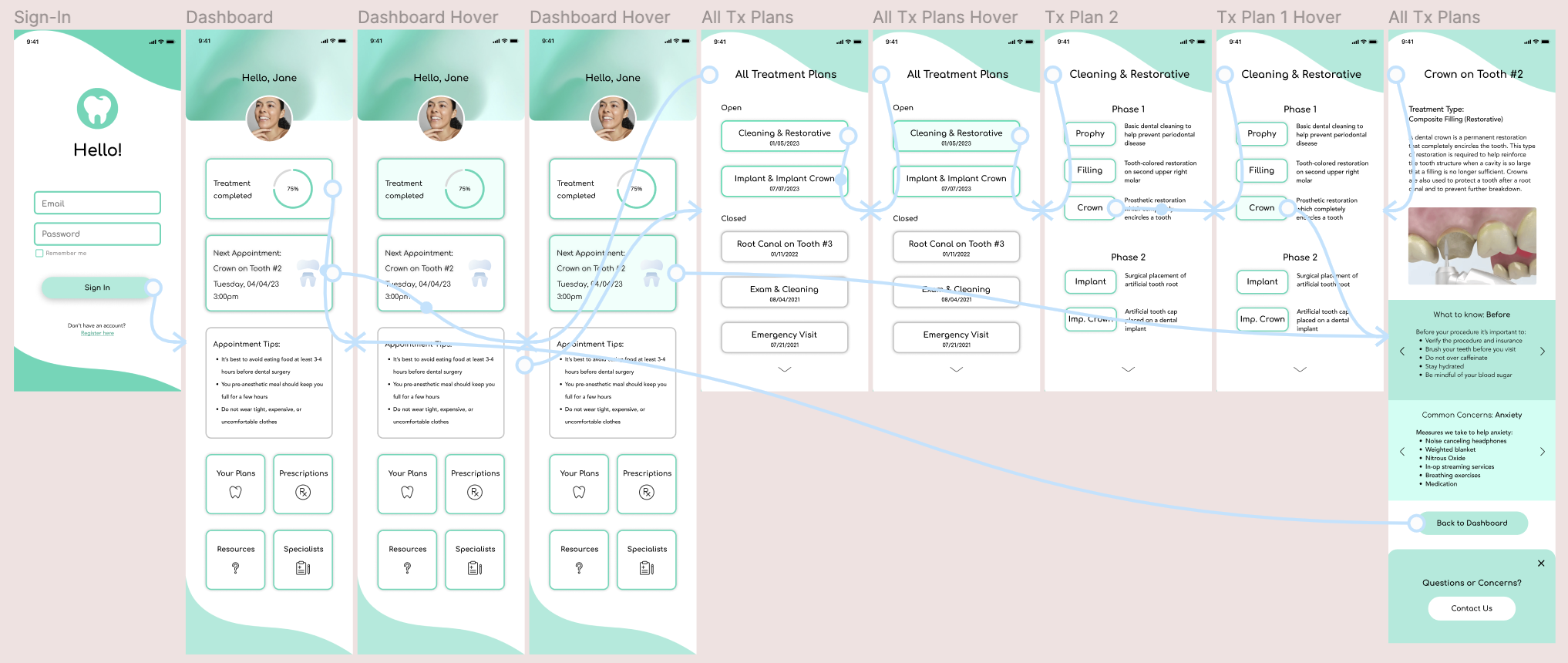
Crafting Lo-Fi Wireframes
After structuring the user flow, I used Figma to create the low-fidelity wireframes. I chose a main “happy path” and mapped out the design of exploring a treatment plan down to the procedure. I also included two shorter flows that detailed accessing prescription information and resources to learn more about a particular topic.
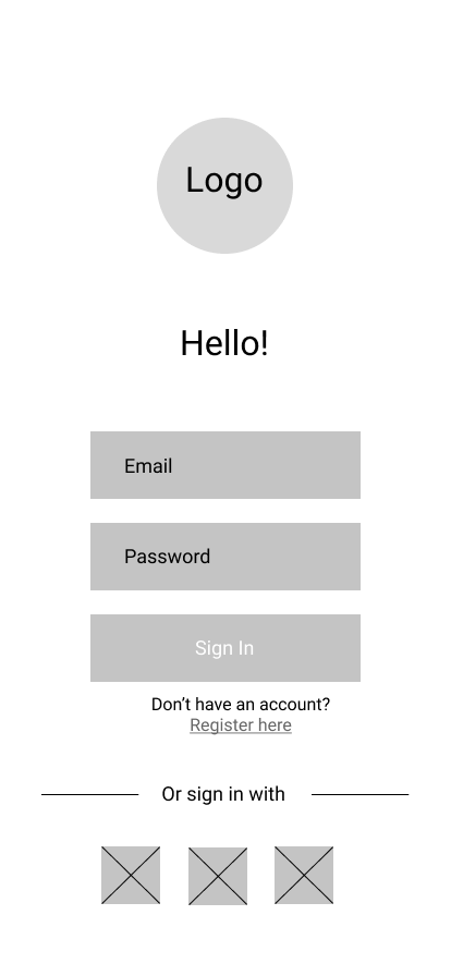
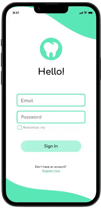
Login
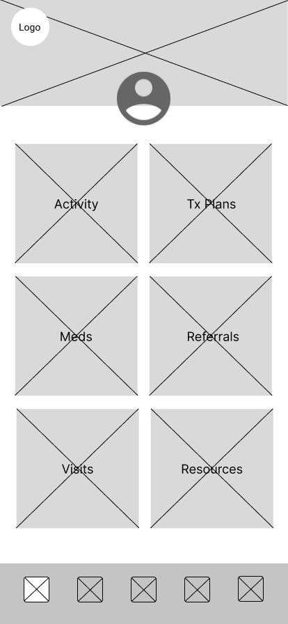
Dashboard: After logging in, the user is taken to the account dashboard which will show activity, treatment plans, resources, etc.
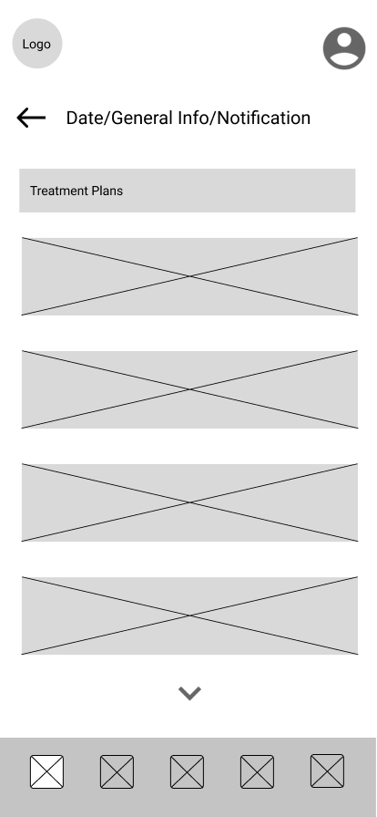
Full Treatment Plan List: The user selects treatment plans to see what is planned for them and get a better idea of the upcoming appointments and details regarding the treatment they need
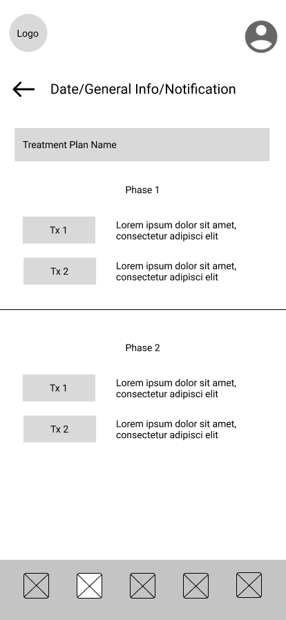
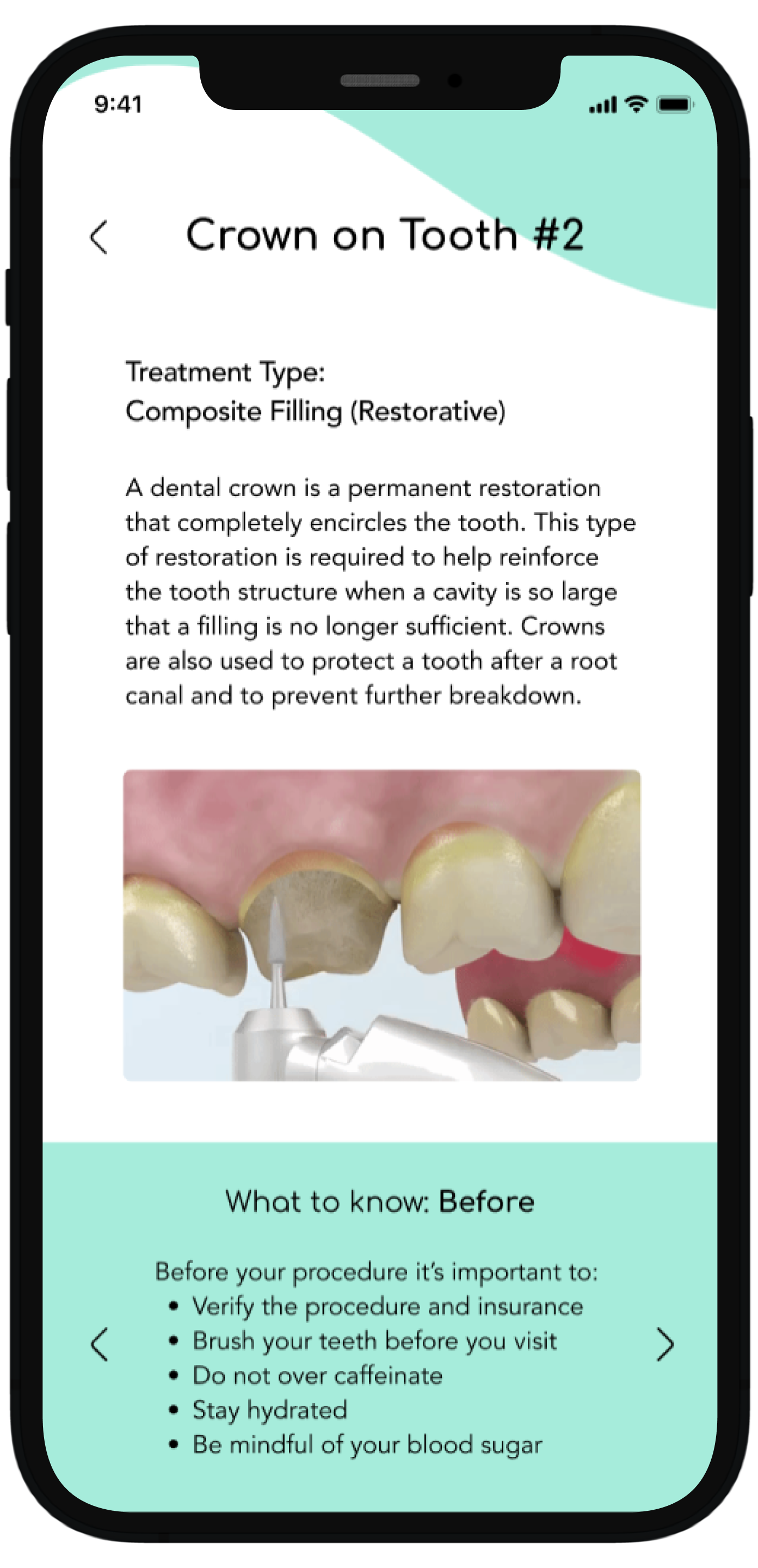
Specific Treatment Plan: After selecting a particular treatment plan the user is shown the plan breakdown which entails each procedure. At this point the user has the option of exploring each procedure further.
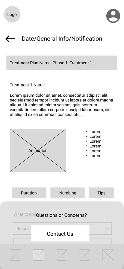
Individual Procedure Details: The final page of the flow shows the procedure selected in detail. There is a summary of the procedure, an animation, followed by useful information, and what to expect.
Fine-tuning the brand
With the design system, I wanted to create a brand identity that was patient forward and trustworthy. I started with creating a mood board that was reflective of all the qualities and feel for what I wanted the final designs to encompass. I used the mood board to help establish the values of the app. Once the voice and tone of the brand were decided, this set the basis for the color scheme, font choices, logo, and components.
Mood Board
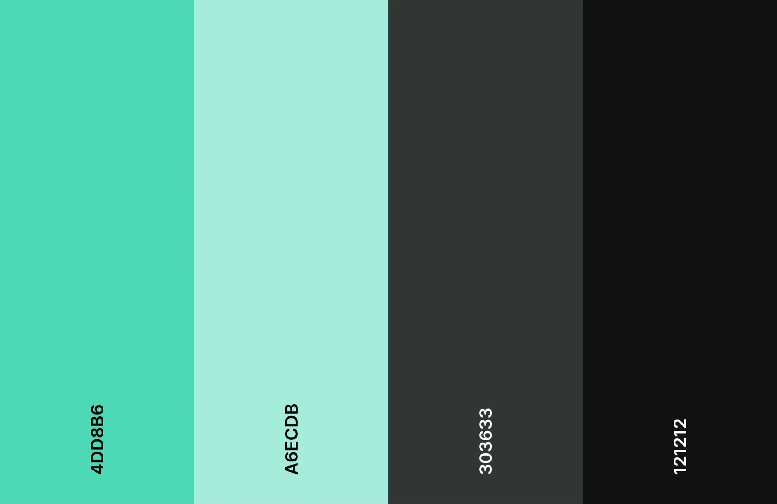
Color Palette
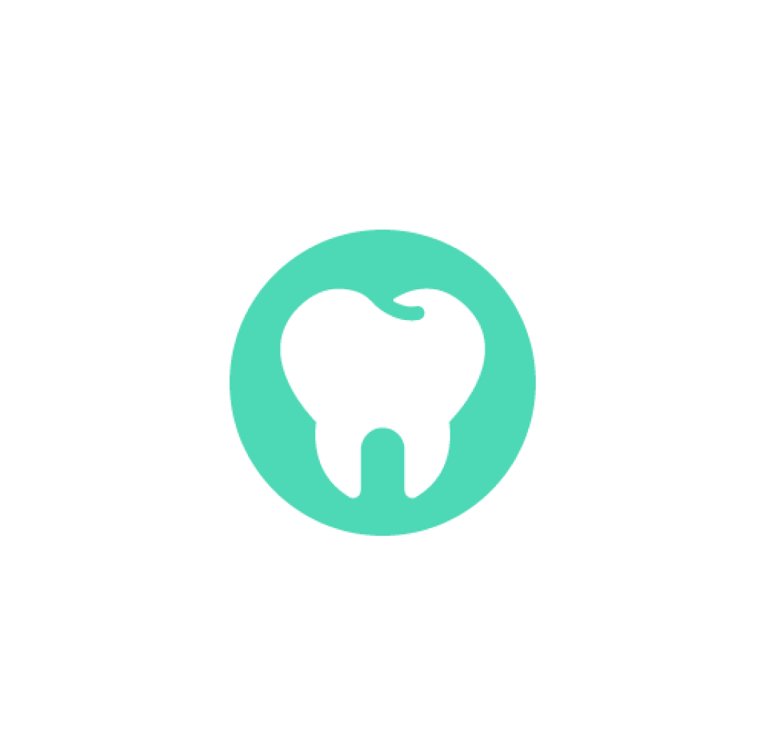
Logo
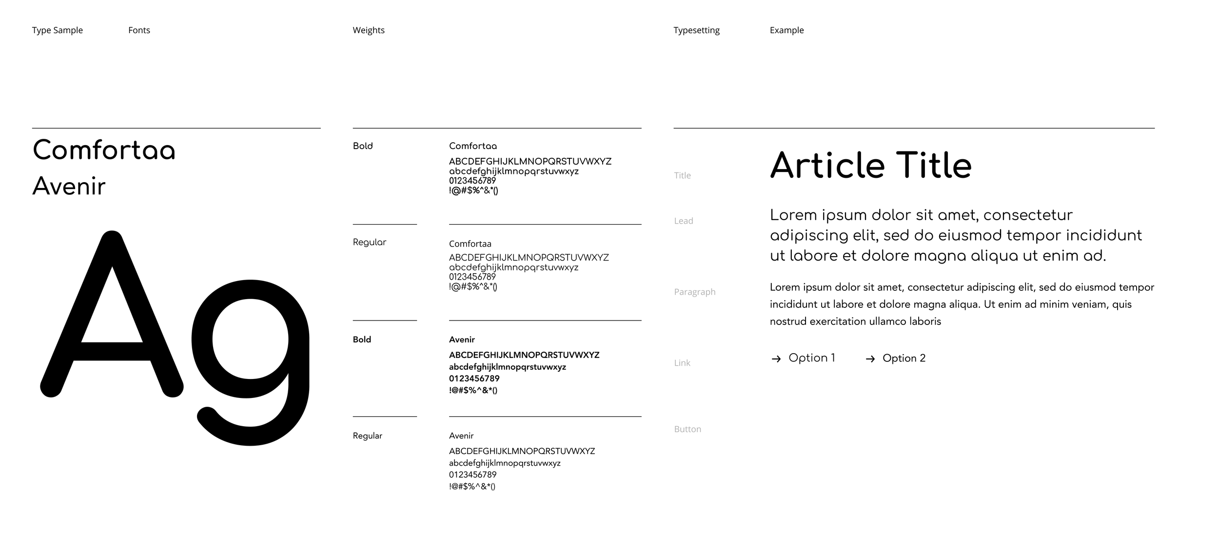
Font System
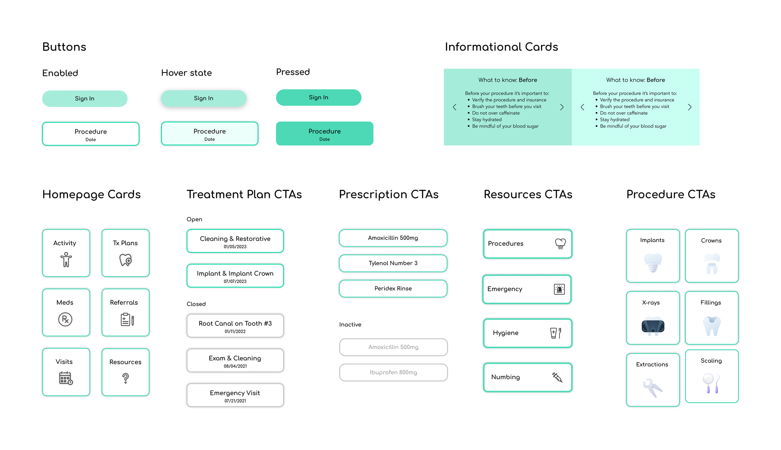
Curating a component library
Once the parameters of the branding were set, the next step was to create a component library. The component library helped to build the designs in an easier and more efficient way. I started with the basic components of the nav bar which was decided on by an icon set I found on Figma, followed by the relevant CTAs and cards for each section.
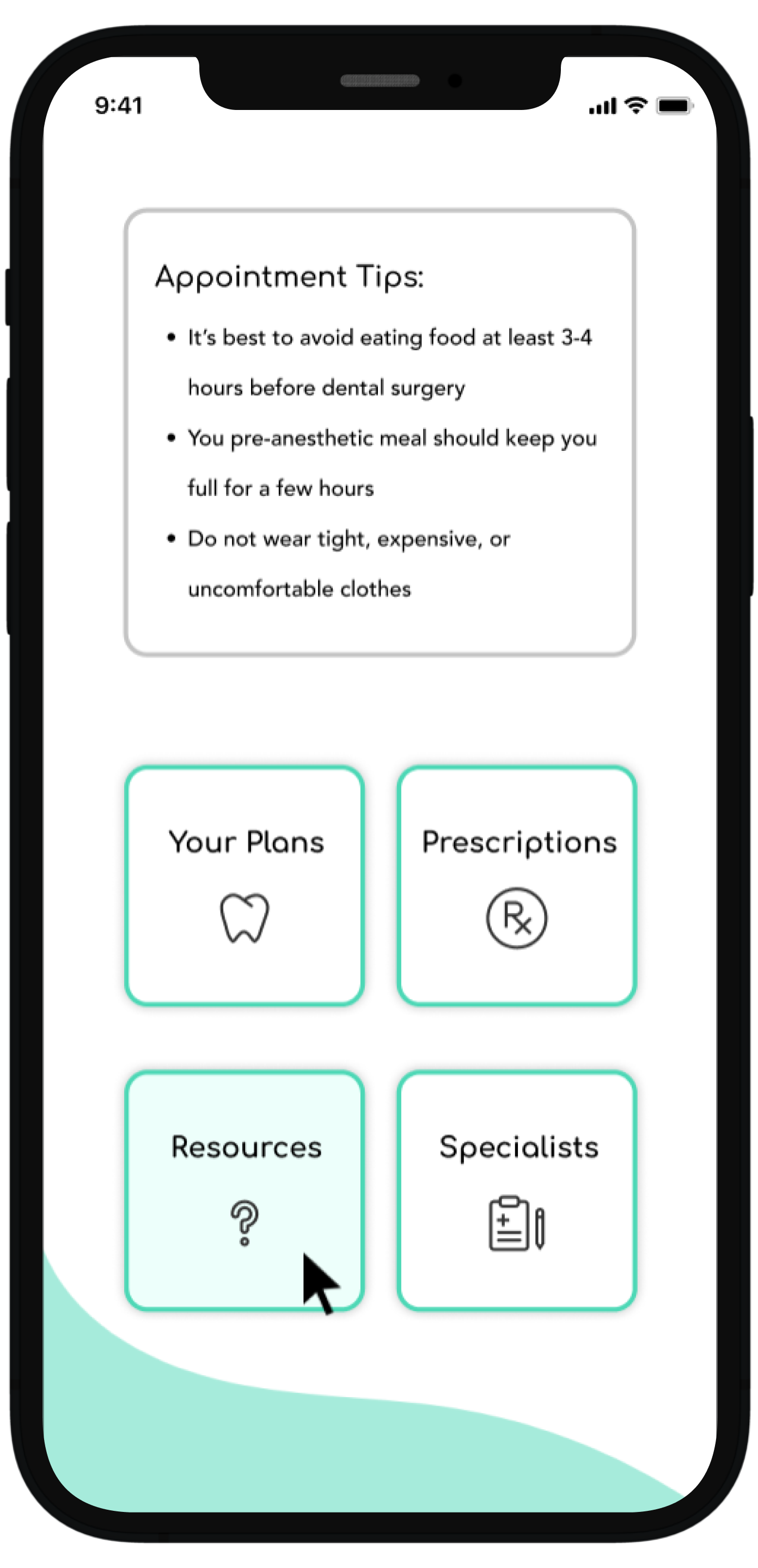
Guiding users through the experience
Navigating the dental visit can be daunting and scary. The purpose of this flow is to eliminate any fear and uncertainty by giving the user the option to delve deeper into their treatment plan details as needed. After the user logs in, they have the option to select their treatment plan of choice with the end of the flow being the specific treatment page. It’s really up to the user how much information they would like to explore.
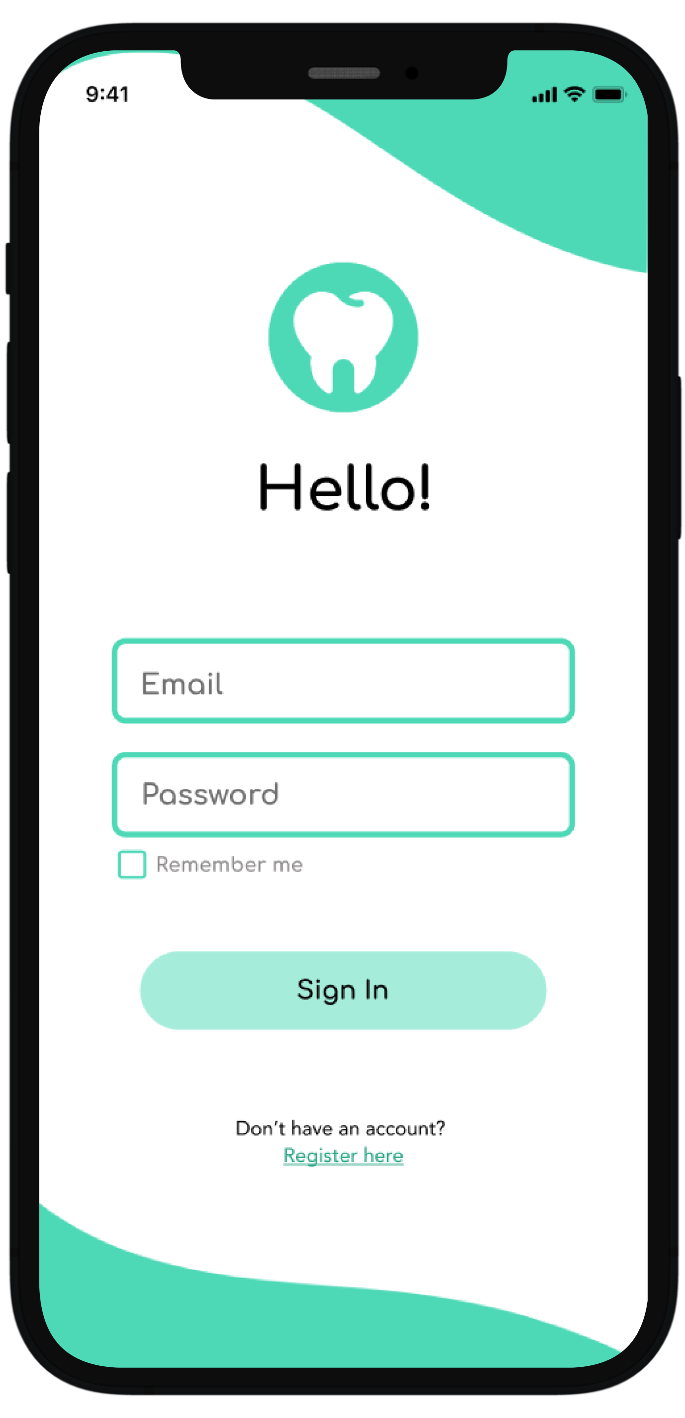
Login
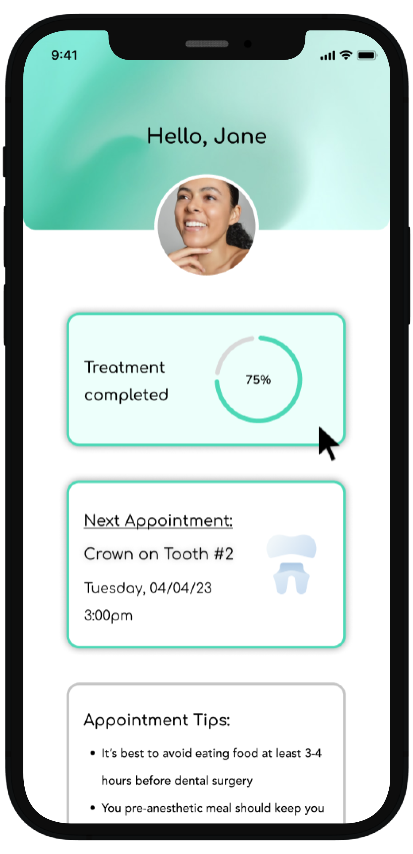
Dashboard upon logging in
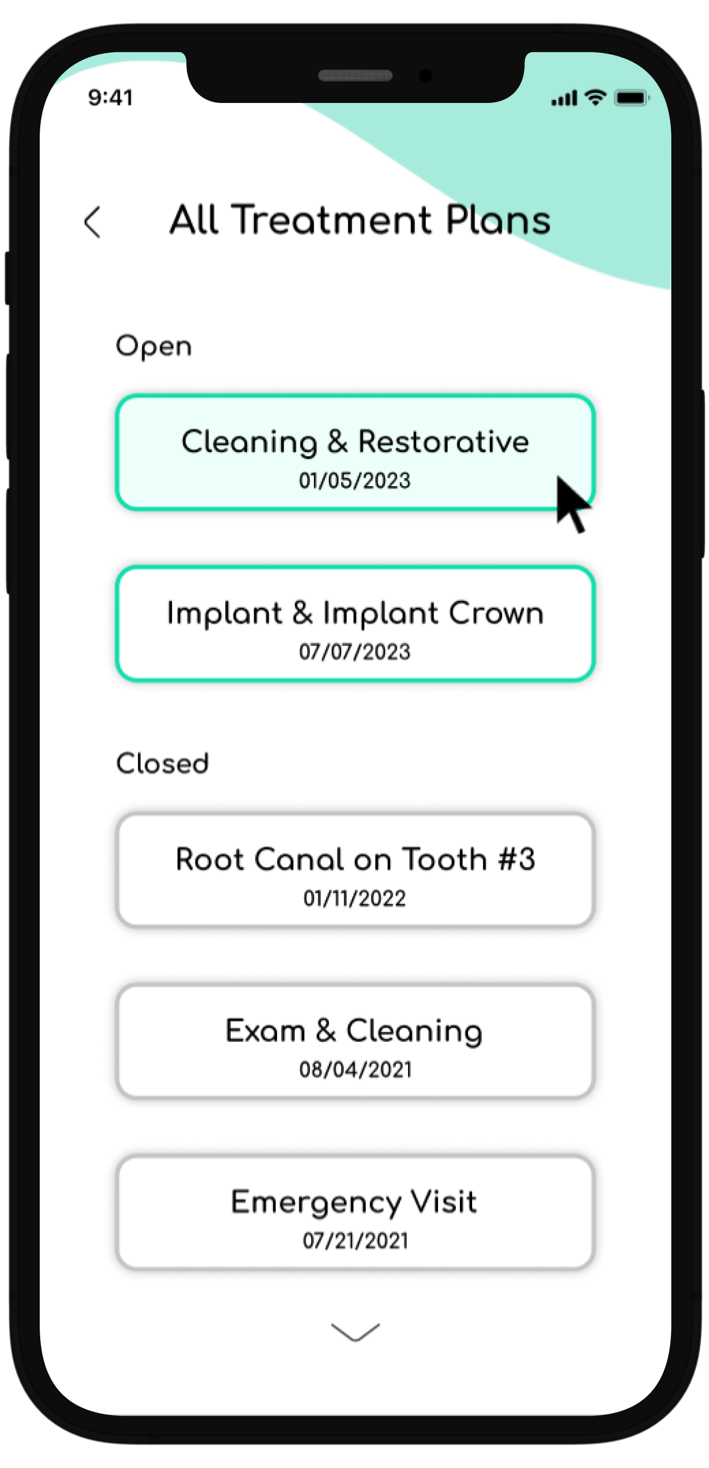
All treatment history page accessed from the dashboard by clicking treatment completed or scrolling to all treatments
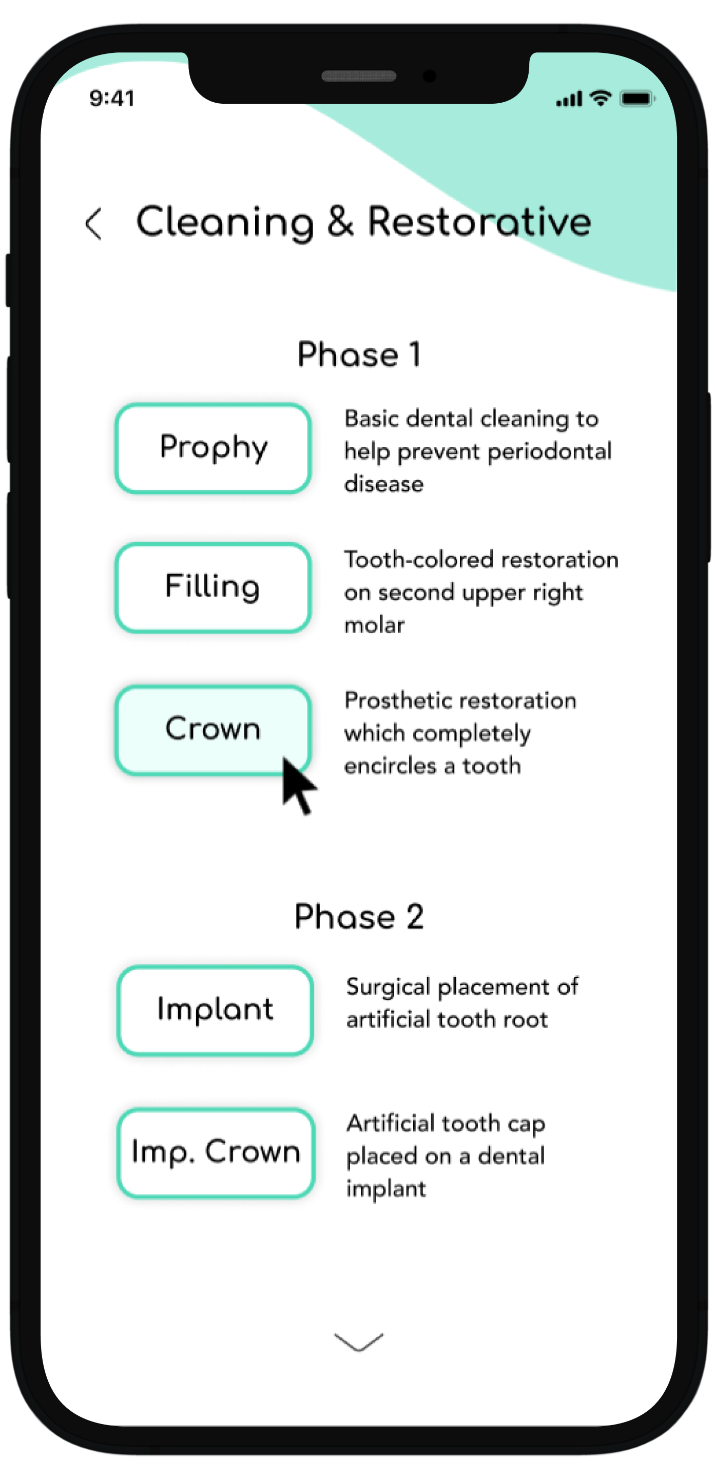
Choosing the most recent active treatment plan and seeing how the treatment is broken down into phases as organized by the provider
Choosing a specific treatment in the current treatment plan to learn more information about what procedure entails, what to know before, during and after, and common concerns
Providing easy-to-access information and education
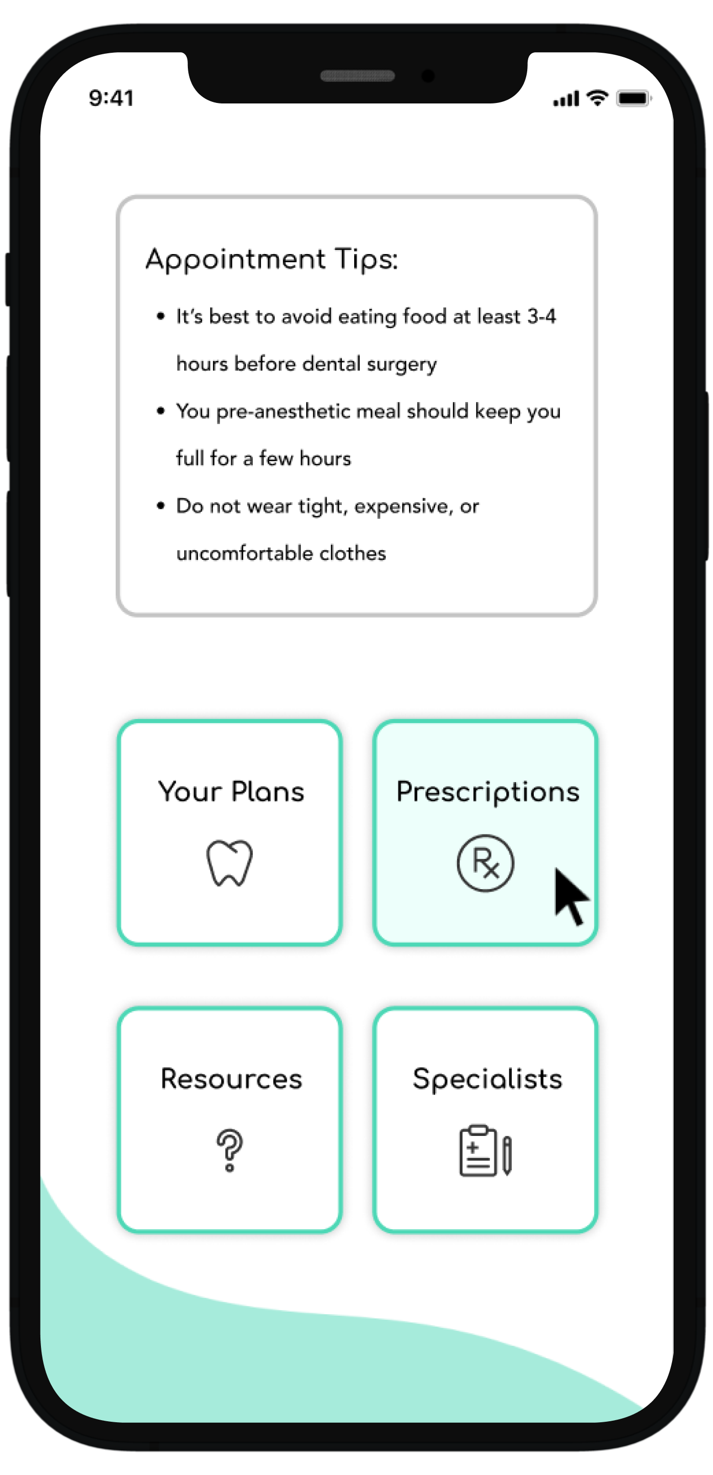
The second flow details how a user can access the “resources” section from the homepage and look further into a topic out of their own curiosity and education exploration. The example here shows a user looking into the specific procedure of implants, with the end flow detailing the procedure with easy-to-understand information, animation, advantages, disadvantages, and alternative treatment options. These categories were chosen based on user interviews and research.
From the dashboard a user can select the resources button to learn more about a variety of topics
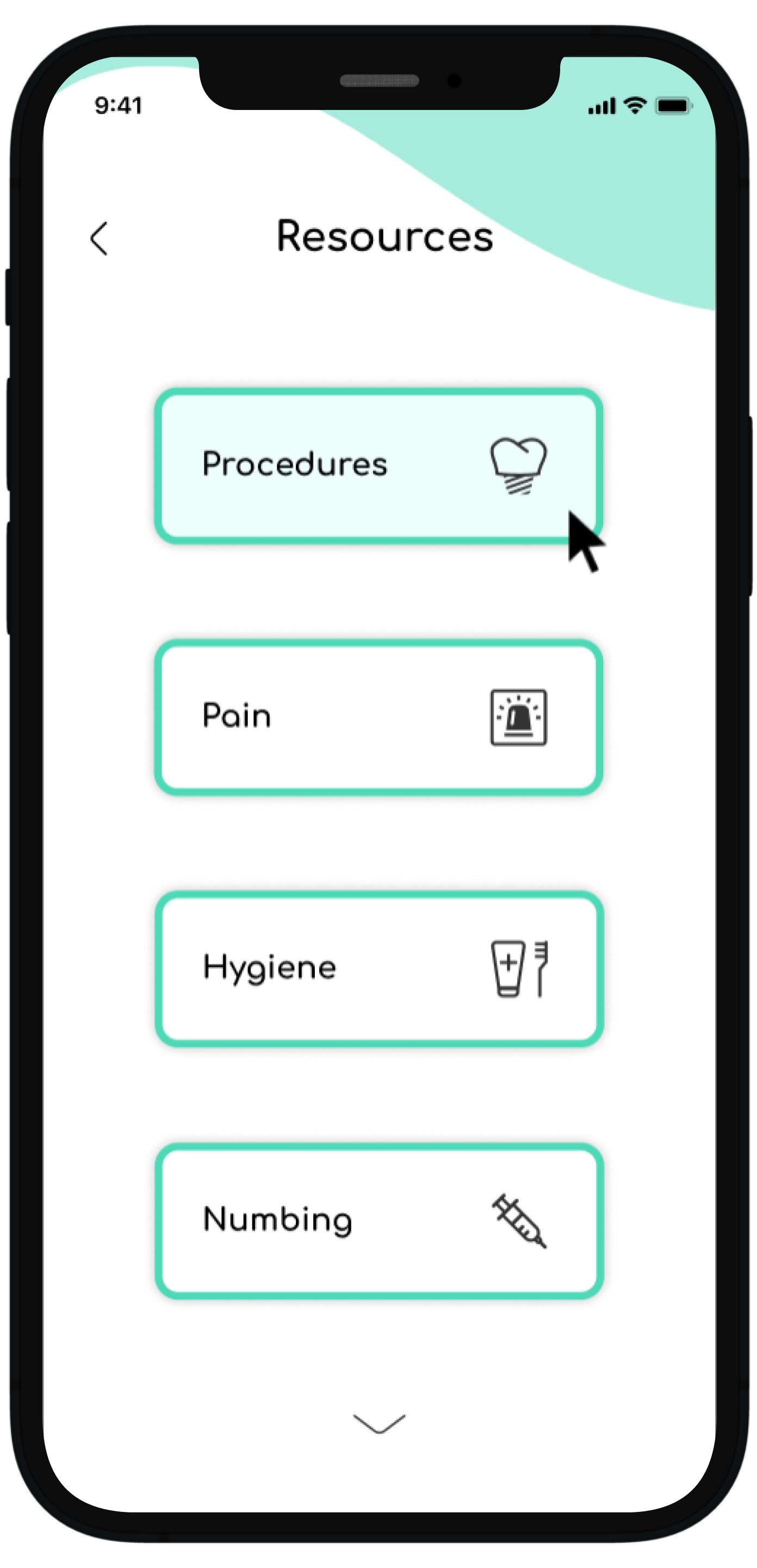
In this example, the user has selected procedures
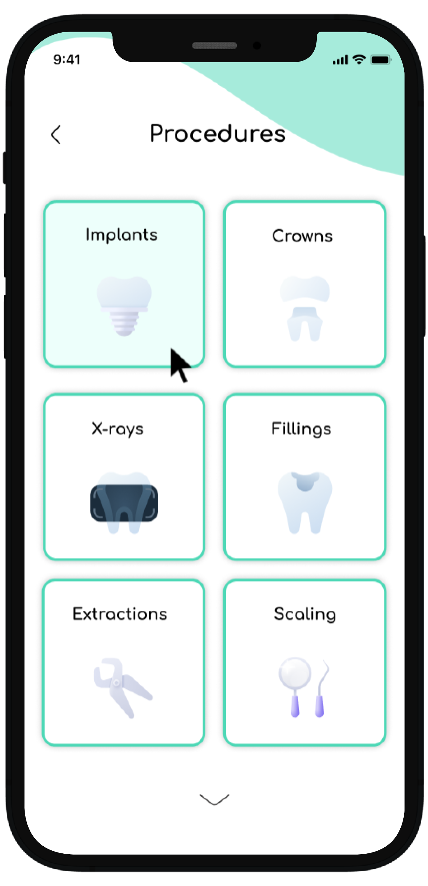
The user would like to learn more about implants, so the user is shown selecting the implant option
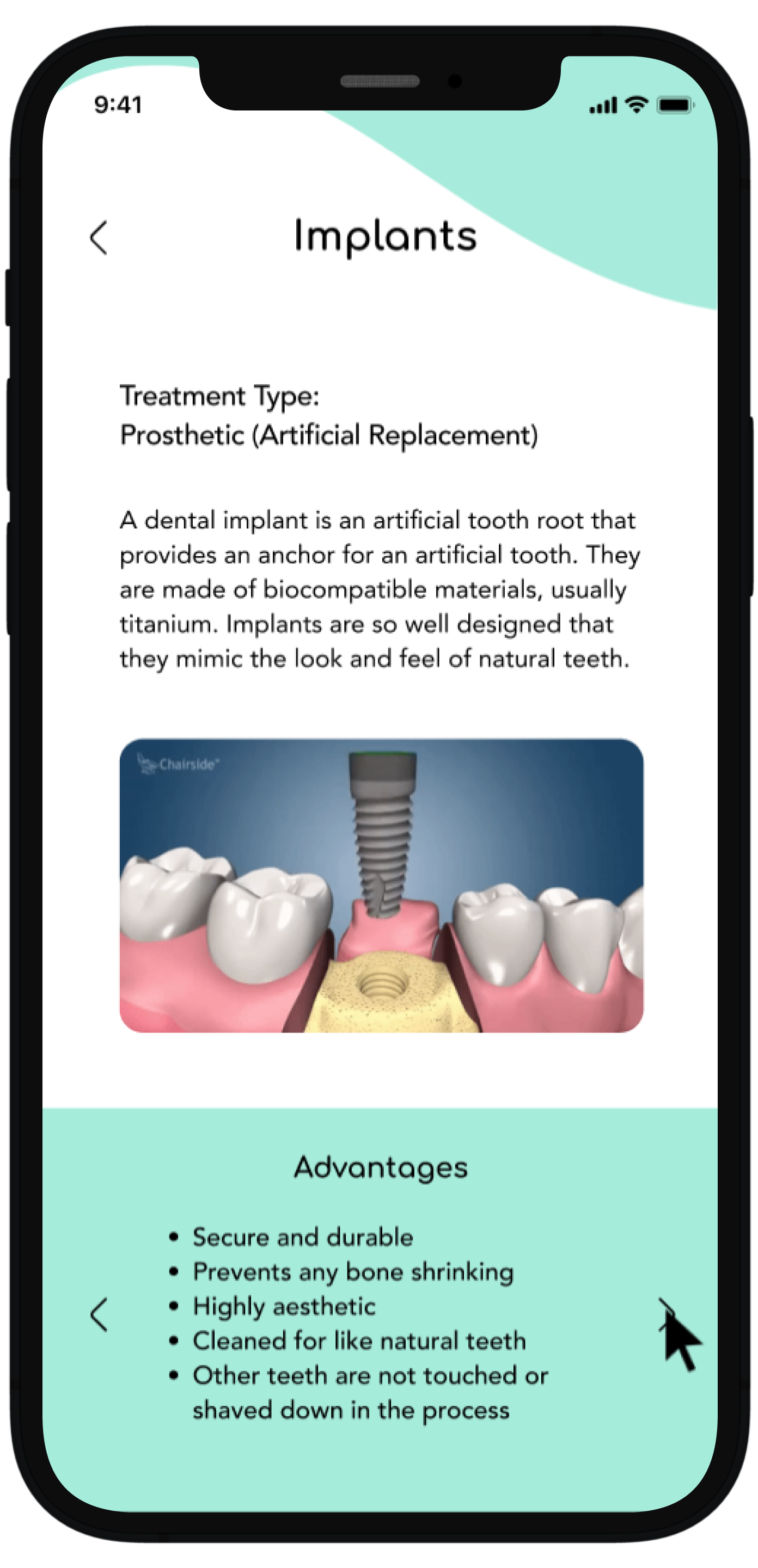
This is the final page of the flow which details the implant procedure and at the bottom it utilizes the same structure seen in previous flows where the user can toggle left or right in a carousel and gain more information
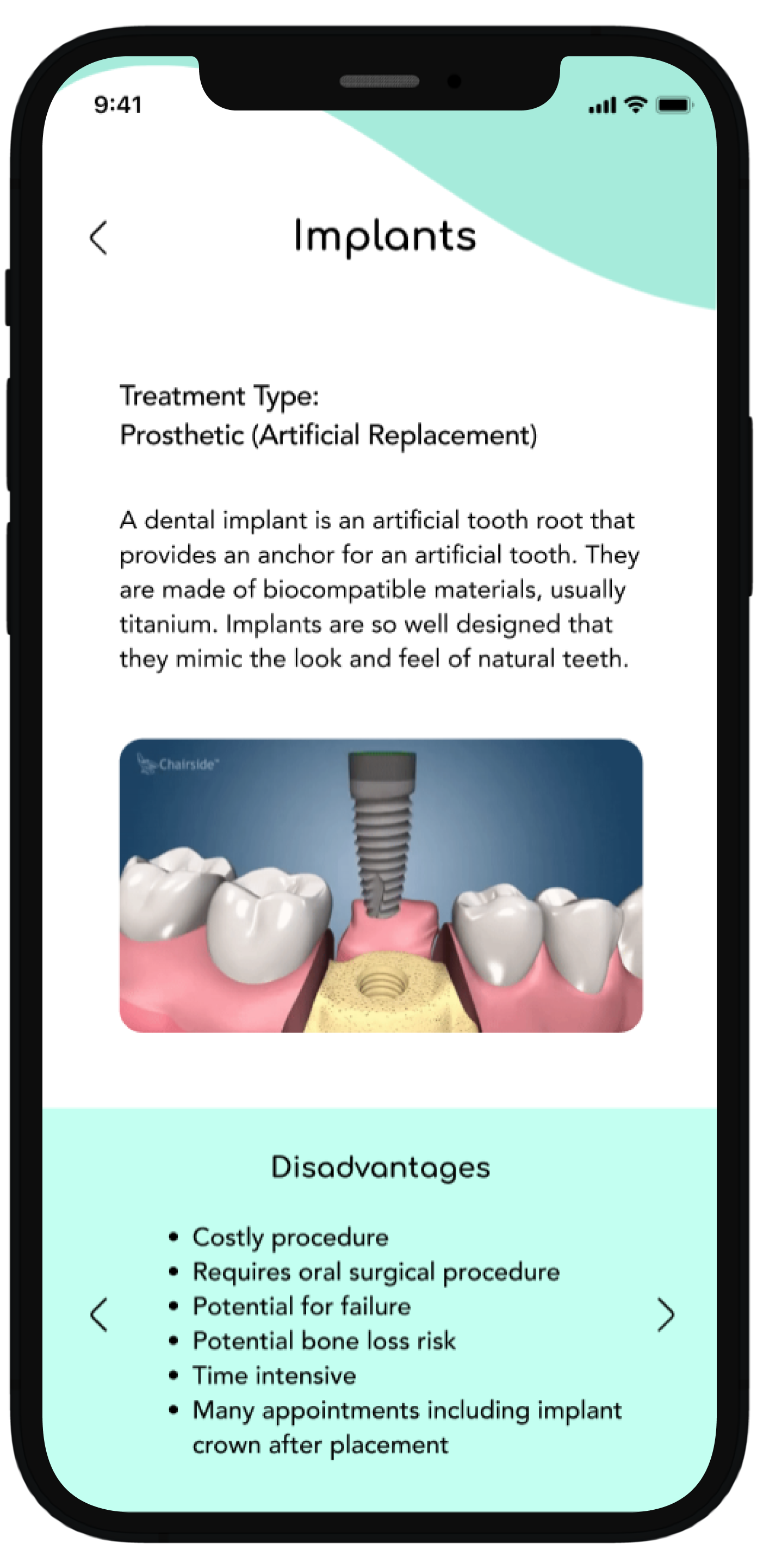
This shows the user having toggled to the right and new information is revealed highlighting the disadvantages, compared to the previous screen which showed advantages
Offering in depth prescription information and tracking
The third and final flow shows how users can access their prescription information with a relevant summary, how the prescription was sent to the pharmacy, and a map confirming where the prescription was sent. At the end of the flow, there is an option, just with the treatment details page, to contact the dental provider with any questions or concerns regarding the prescription.
Select prescription from main dashboard
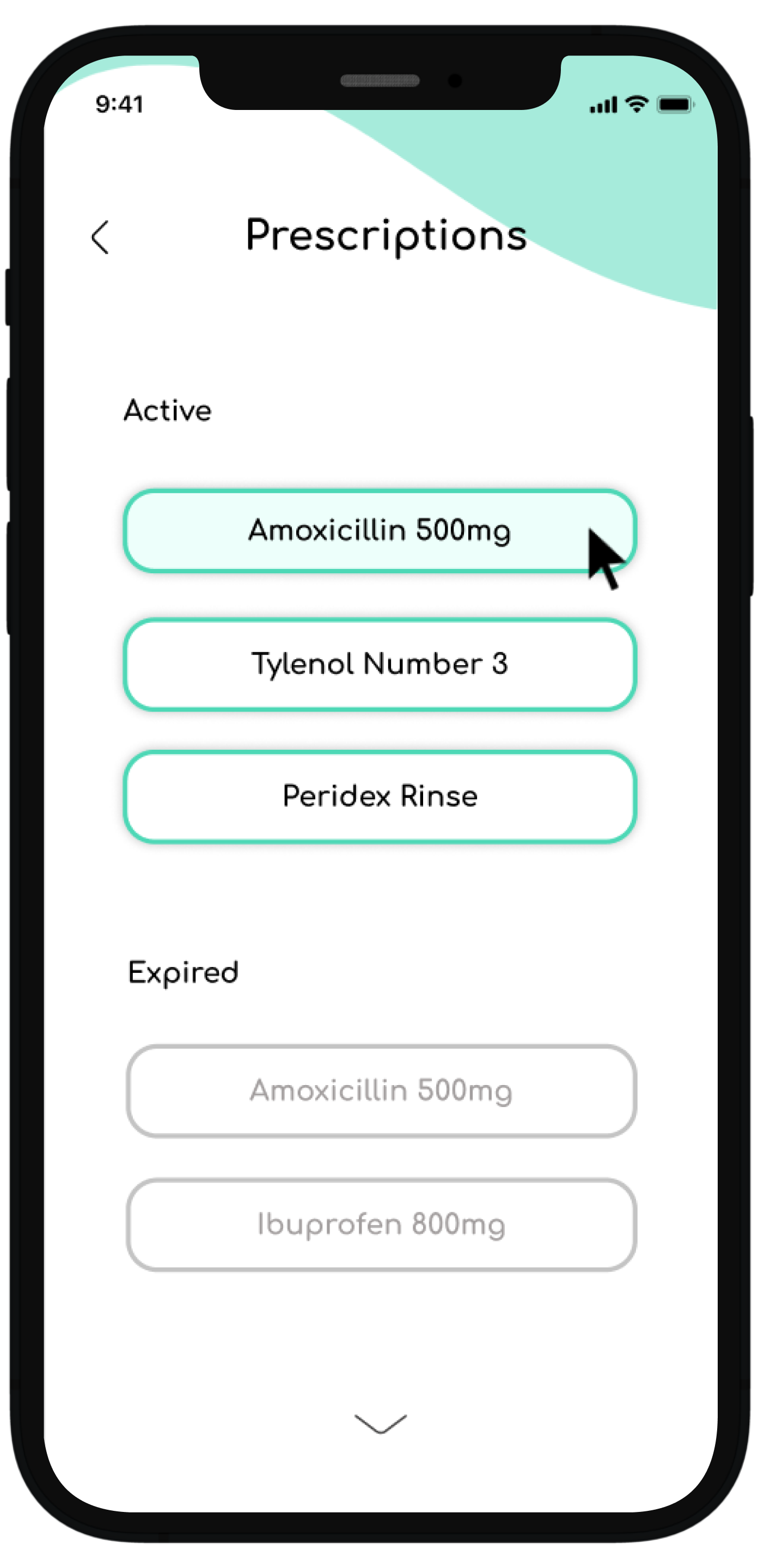
This will show all prescription history and if the user wishes to find more information regarding an active prescription they can select from here
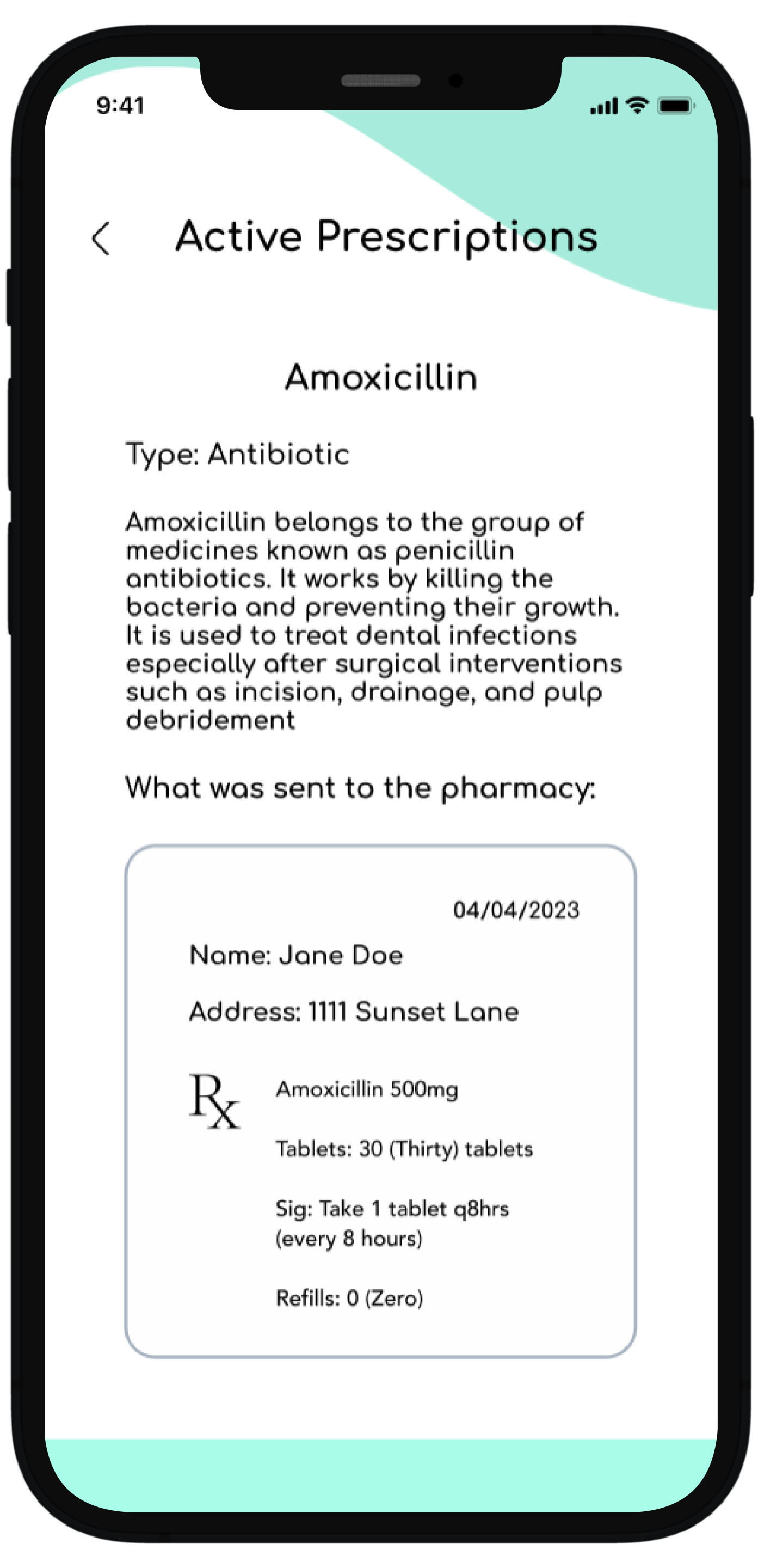
They then are taken to this specific medication page where they get all relevant details regarding this particular prescription
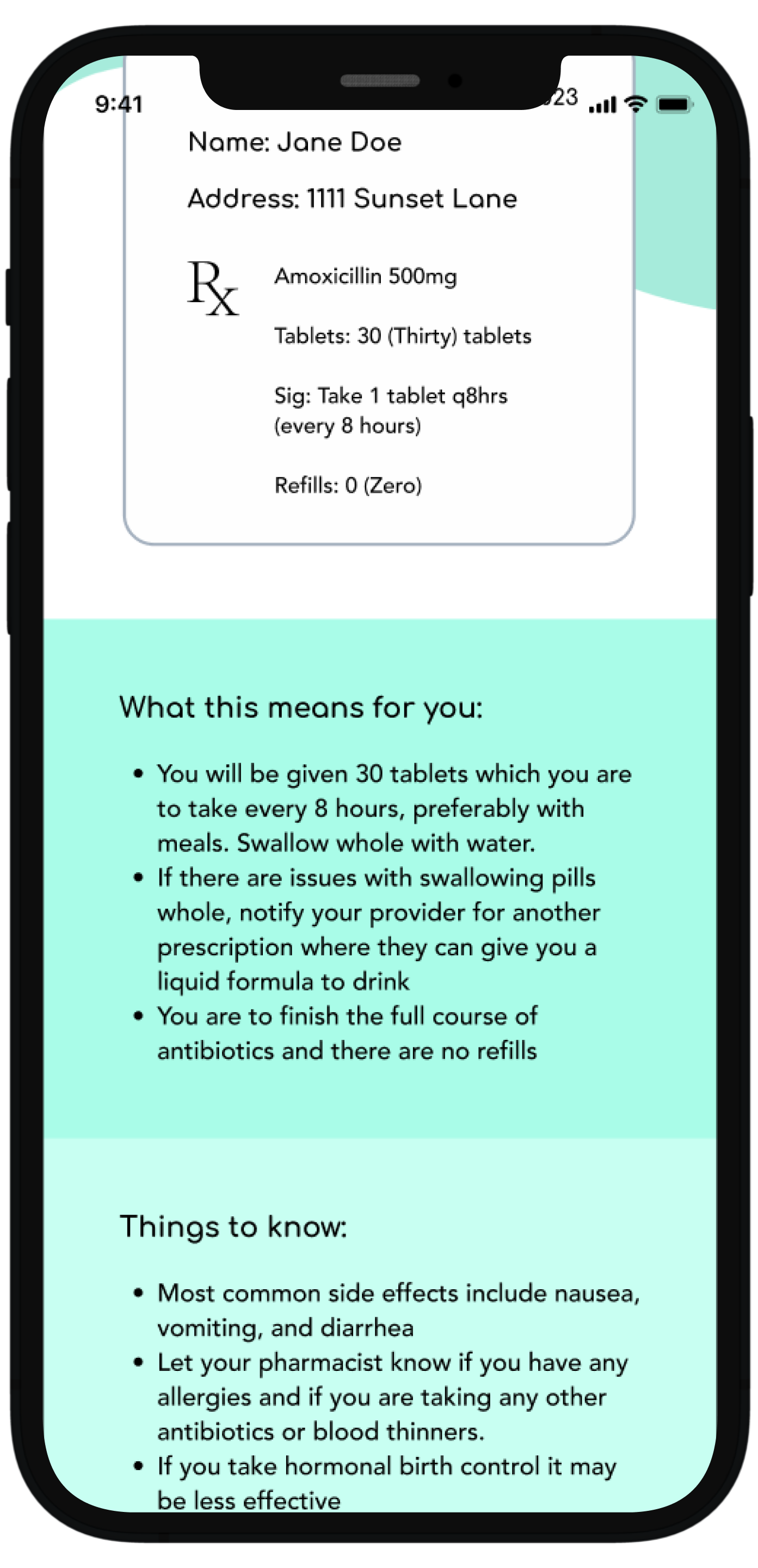
Scrolling down the user gets information about how the prescription was sent to the pharmacy, what this means, and important things to know about this particular medication
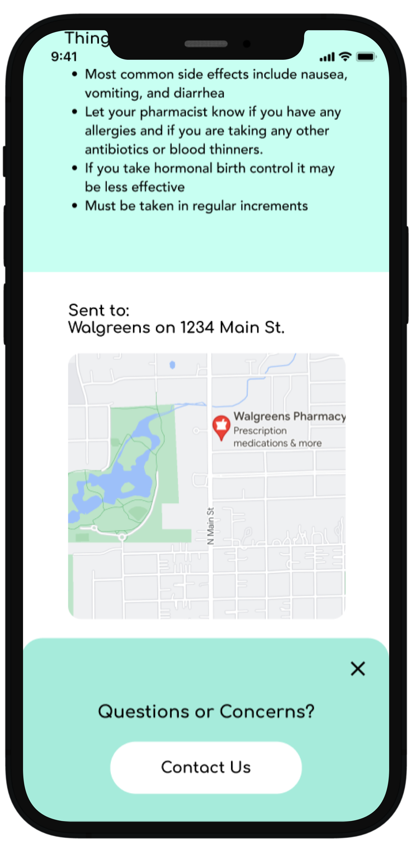
Continued scrolling reveals the location where the prescription was sent and an interactive map and it is at this point where a pop-up notifies the user if they have any questions they can contact the office
Conducting usability testing to refine the experience
I tested the app with participants who have visited the dentist at least twice a year for their 6-month check-up, had dental treatment completed at some point in the past 5 years
My goal was to see how users navigate through the Bite App, what aspects are intuitive, what aspects are not as easily understood, and opportunities for improvement.
What I learned from user feedback:
How I addressed the issues:
Added labels and definitions where they were lacking and simplified wordage. For example, the term “referrals” was changed to “specialist” based on user testing.
Some of the terminology and labels were not obvious and a bit too technical.
I changed the formatting and structure to introduce information progressively, starting with essential concepts before delving into more detailed and advanced information. This gradual approach caters to users with varying levels of familiarity.
Implementing progressive disclosure by hierarchically layering information keeps the user from being overwhelmed.
User affordances have been added for clarity. These included adding a color change on hover, structuring consistent navigation patterns, and establishing a clear visual hierarchy with distinct headings, font sizes, and color contrasts.
Some cards were not perceived as clickable which affected important KPIs such as task completion time, time on task, and ease of use.
Positive effects on practice growth and revenue
Building trust maintains existing patients and gains the confidence of new patients, increasing the overall patient base and practice revenue
Patients can review recommendations, post-treatment instructions, and potential signs of complications. This empowerment can lead to better compliance, reducing the likelihood of emergencies or the need for follow-up appointments due to misunderstandings.
By giving users more information and autonomy over their health care, there is a greater chance of treatment acceptance
Using the app for visual treatment plan representations aids patient understanding of proposed procedures, addressing common concerns and contributing to increased case acceptance rates.
Having information readily available, reduces unnecessary emergency and follow-up appointments, optimizing overall practice collections
Providing educational resources, treatment details, and clear communication through the app establishes transparency. Patients who feel informed and engaged are more likely to trust the dental practice and stay loyal patients.
Key Project Takeaways
Recognizing and addressing health literacy challenges is essential for effective communication in healthcare apps
In future healthcare-related projects, I will assess the target audience's health literacy levels and design content that is accessible and understandable to diverse users. Implementing plain language principles, visual aids, and interactive features will enhance health literacy and improve user comprehension.
Incorporating interactive and gamified elements enhances user engagement and motivation
In the future, I will consider integrating interactive features, gamification, or other dynamic elements in future educational apps or projects. This approach not only keeps users engaged but also contributes to a more enjoyable and effective learning experience.
Focused on branding and visual design, I recognized project constraints and committed to learning and integrating developer considerations in the future
Given more time or different project circumstances, I would have liked to incorporate considerations related to developers. This could include factors such as coding feasibility, responsiveness to different devices, and collaboration with developers for seamless implementation