
Revamping the Pricing Page Layout on the Premium Page Increased Subscriptions
Role: Product Designer
Client: Thrifty Traveler
Problem: Mobile visitors to the Premium page struggled with a pricing table where the "Join Premium" CTA wasn’t immediately visible, and the distinctions between the Limited, Premium, and Premium+ plans were unclear. The long list of features made it difficult to quickly compare options, leading to confusion and missed subscription opportunities.
Solution: Redesign the pricing table on the Premium page for mobile users to ensure the "Join Premium" CTA is immediately visible without scrolling, and to make the distinctions between the Limited, Premium, and Premium+ plans clearer and easier to scan.

The A/B Testing Process
Why We Chose to Simplify the Mobile Pricing Layout
This test was part of an ongoing effort to optimize subscription conversions, particularly among mobile users. While research showed that the majority of Thrifty Traveler's users are still desktop-based, a recent year-over-year analysis revealed that the mobile segment is growing rapidly, making it essential to optimize the mobile experience. By improving the layout and clarity of the pricing page, we aimed to reduce friction in the decision-making process and increase conversions. The condensed mobile pricing table was designed to make the "Join Premium" CTA more accessible and improve the clarity between subscription options.
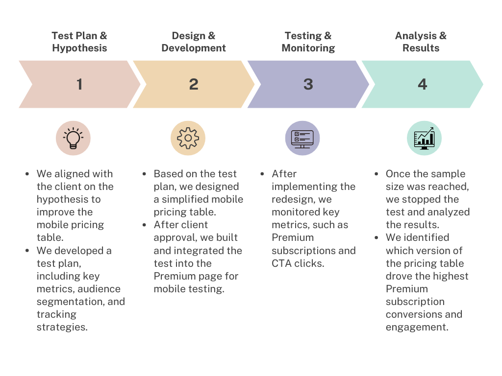
Phase 1. Test Plan & Hypothesis Development
To address the issue of mobile user confusion, we identified the opportunity to revamp the pricing table layout. After reviewing insights from previous tests and user feedback, we refined our hypothesis:
Hypothesis:
We believe that implementing a condensed pricing table on the Premium page for mobile visitors, where the “Join Premium” CTA is visible without scrolling and the choice between Premium and Limited plans is clearer, will increase premium subscriptions.The Test Plan also detailed the following:
Redesign Scope: Focused on mobile only.
Metrics to Measure Success: Premium Subscriptions, Join Limited Clicks, Join Premium Clicks.
Tracking Plan: Work with the analytics team to monitor key interactions and track CTA clicks, subscription actions, and user flow to ensure the test was measuring the right outcomes.
Phase 2. Design & Development
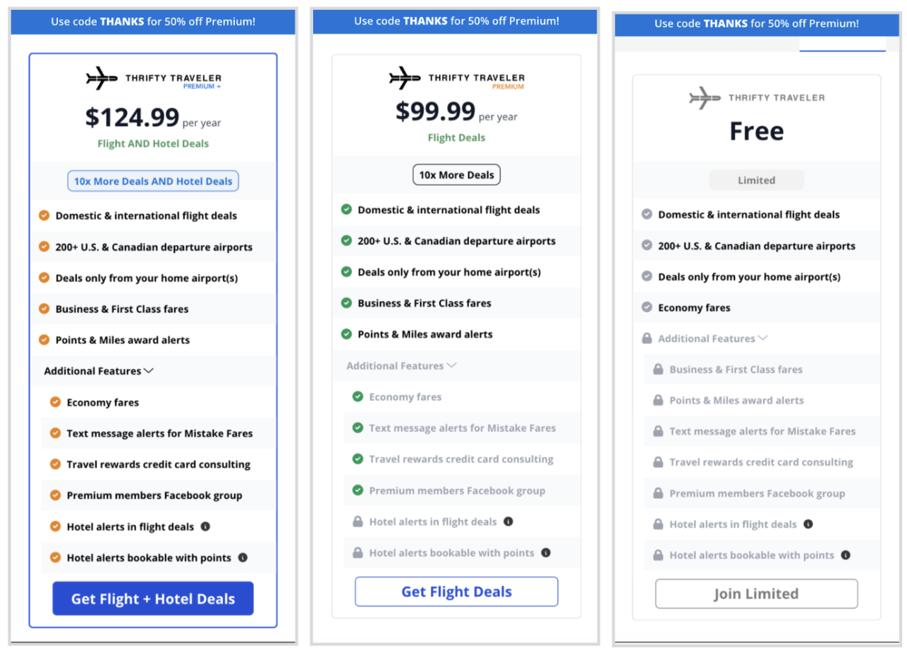
Design Decision: We redesigned the mobile pricing table to clearly display the Limited, Premium, and Premium+ plan options, with the "Join Premium" CTA fixed above the fold for better visibility.
The design was streamlined to make each plan more distinct, helping users quickly compare options and make more informed decisions.
Design Details:
Condensed Layout: The table was simplified using an accordion design to present essential information upfront, with the "Join Premium" CTA prominently visible. This approach utilized progressive disclosure, allowing users to expand additional details only if needed, reducing visual clutter while maintaining accessibility to key plan differences.
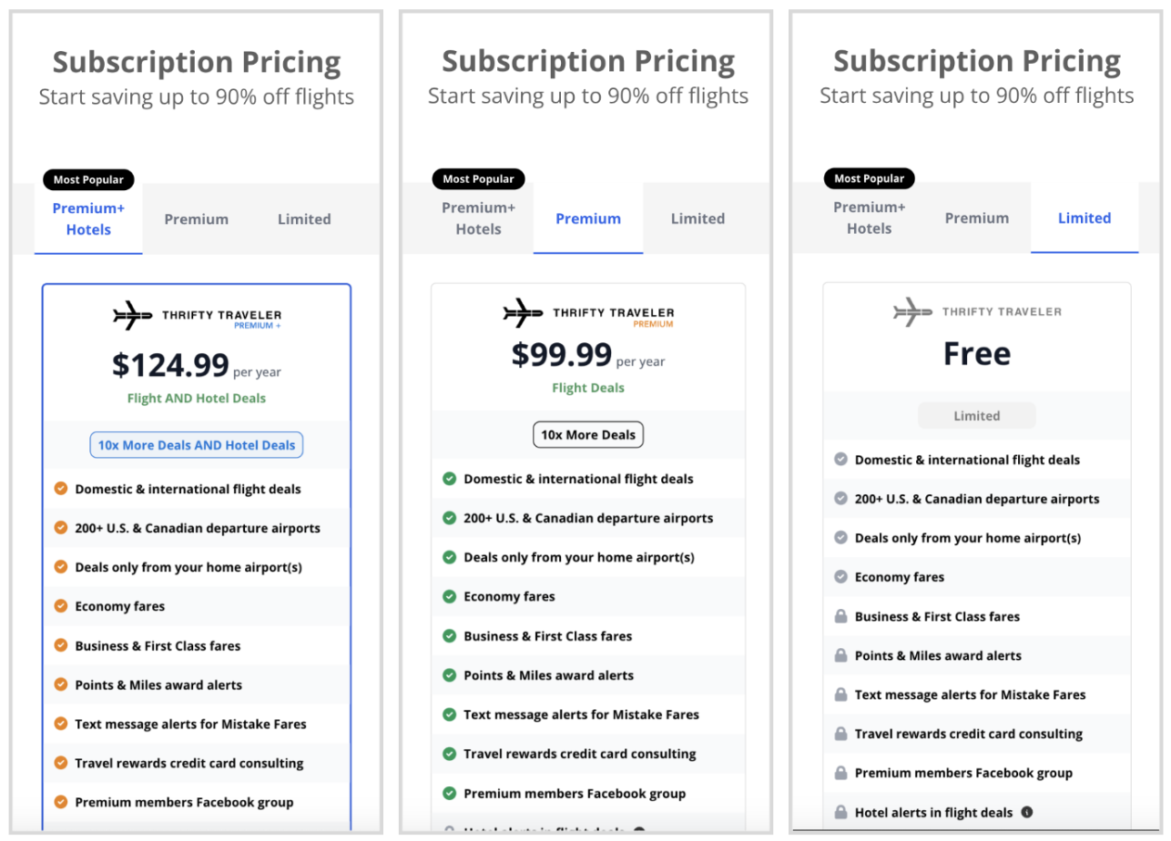
Control
Variant: Mobile Pricing Table Redesign
(Accordion Closed)
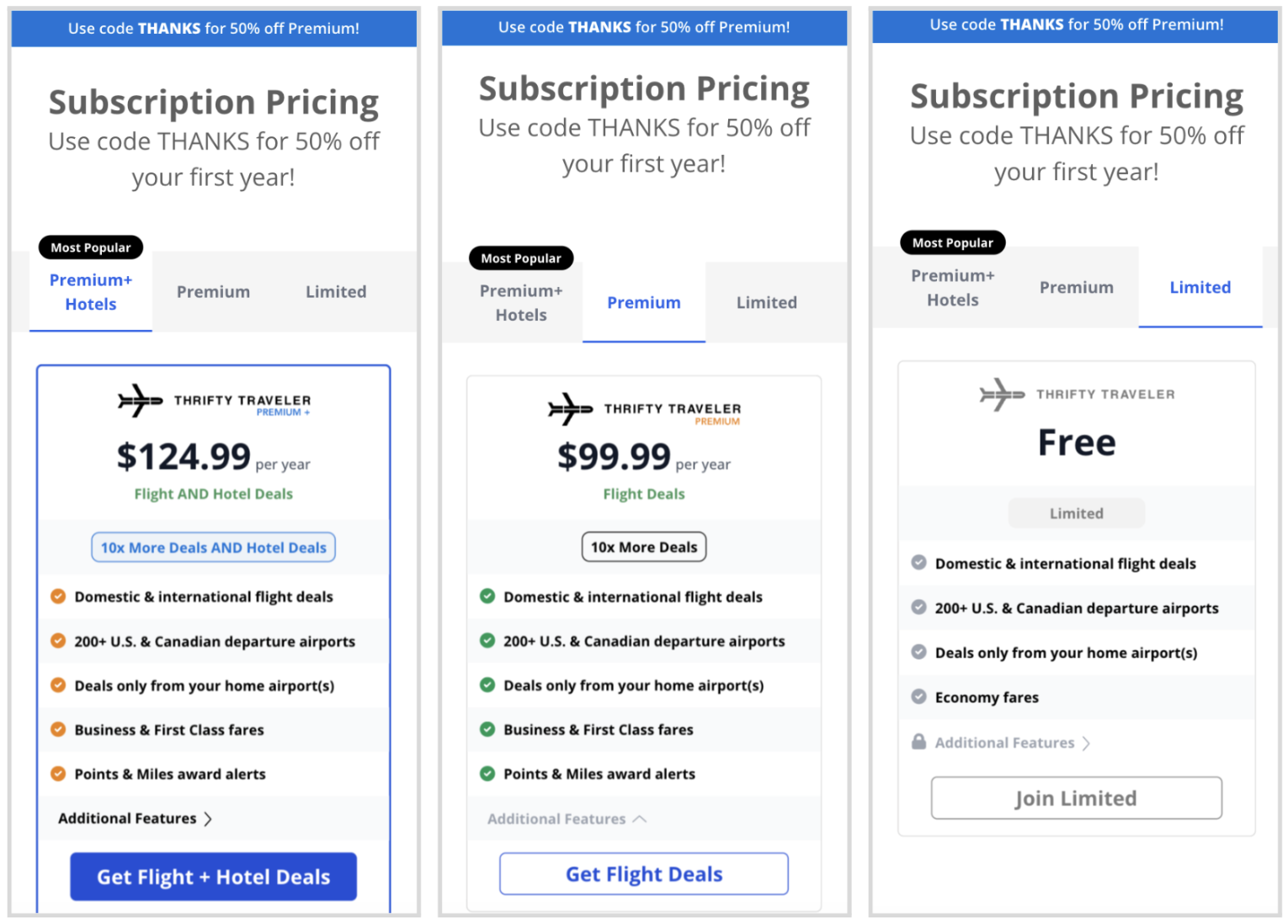
Variant: Mobile Pricing Table Redesign (Accordion Closed)
Phase 3: Testing
Variant 1:
The redesigned, condensed mobile pricing table with visible "Join Premium" CTA and clearer differentiation between Premium and Limited plans.
Control:
The original, more cluttered pricing table where users had to scroll to see the "Join Premium" CTA.
We set clear success metrics: We wanted to evaluate the impact on Premium Subscriptions, Join Premium Clicks, Join Limited Clicks, and overall user engagement with the pricing table.
Phase 4: Analysis & Results
Analysis: After the test concluded, we analyzed the data to compare the performance of the redesigned pricing table against the original version. We focused on key metrics such as Premium Subscriptions, Join Premium Clicks, and Join Limited Clicks to measure the success of the layout changes.
Results:
Premium subscriptions increased by 18%, confirming the hypothesis that a more visible CTA and clearer plan differentiation would drive conversions.
Join Limited clicks dropped by 22%, indicating that the redesign made the Premium plan more attractive and streamlined the decision-making process.
Checkout views on the Premium page increased by 25%, and Join Premium clicks rose by 34% , showing that users were more engaged with the pricing page.
Additional Insights:
The decline in Limited Signups indicates that the clearer presentation of Premium options may have steered users toward a higher-value plan, reducing freemium sign-ups. This suggests clearer differentiation between options can reduce cognitive overload, allowing users to make faster, more confident decisions, ultimately improving conversion rates.Key Takeaway: The redesigned pricing table effectively increased Premium Subscriptions because it addressed critical user pain points: the CTA was made more visible, and the distinctions between the plans (Limited, Premium, Premium+) were clearer. By simplifying the presentation and removing clutter, users could quickly understand their options and make decisions faster. The drop in Join Limited Clicks supports this, showing that by making Premium more attractive, we eliminated confusion and guided users toward higher-value subscriptions.
Conclusion & Next Steps
Conclusion: The redesigned mobile pricing table successfully increased Premium subscriptions by improving CTA visibility and clarifying plan distinctions. The test reinforced that enhancing visibility and simplifying decision-making on mobile drives higher conversions.
Learnings:
Simplified Options Drive Faster Decisions: By reducing cognitive load, the clearer distinctions between plans enabled users to make quicker, more confident decisions.
Visible CTAs Boost Engagement: Keeping the CTA prominent ensures fewer distractions and higher chances for users to act.
Mobile Optimization Is Crucial: Optimizing for mobile—where screen real estate is limited—ensures CTAs remain visible and prevents missed opportunities as mobile traffic continues to grow.
Future Testing Recommendations:
Test variations of the pricing table with additional content or plan benefits to assess if this boosts conversions further.
Explore mobile-first subscription features across other areas of the site to identify and address additional friction points in the user journey.