
Filter and Sort Button Designs Improved Leads on the Product Listings Page
Role: Product Designer
Client: Pinnacle Promotions
Problem: Visitors to the product listings page were not engaging with the filter and sort options, making it harder for them to find the products they wanted, leading to missed conversion opportunities. The current filter and sort design was subtle and not easily noticeable, which discouraged interaction.
Solution: Redesign the filter and sort elements to make them more prominent and interactive by changing their styling to buttons with clear icons. This would improve visibility and encourage users to engage more with the product listings, ultimately improving conversion rates.
The A/B Testing Process
Why We Decided to Test a More Visible Filter and Sort Function
This test aimed to optimize user engagement on the product listings page by making the filter and sort functionality more obvious to users. Research showed that users were not actively engaging with the filter and sort options, which made it harder for them to find the products they were looking for. By improving the design of these elements, we hoped to enhance the browsing experience, leading to higher conversion rates and increased lead generation. The variant redesign turned the filter and sort dropdowns into visible buttons to improve their prominence and encourage more active use.
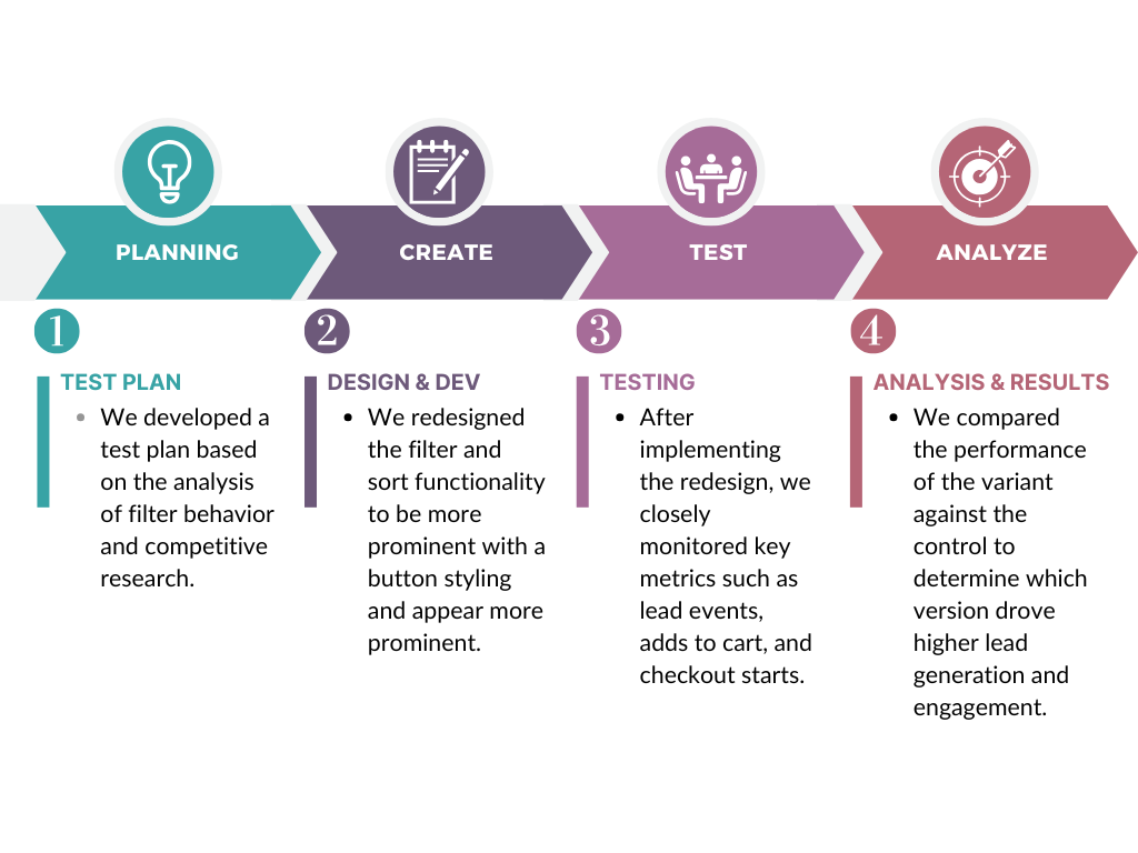
Phase 1. Test Plan & Hypothesis Development
To address the issue of low engagement with the filter and sort functionality, we hypothesized that making these elements more visible and accessible would improve user interaction and conversion rates.
Hypothesis:
We believe that redesigning the filter and sort options into more prominent buttons will increase engagement with the functionality, leading to higher conversion ratesSummary of Opportunity:
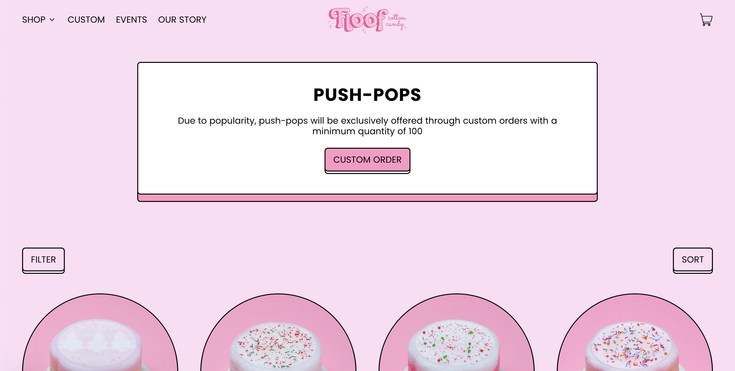
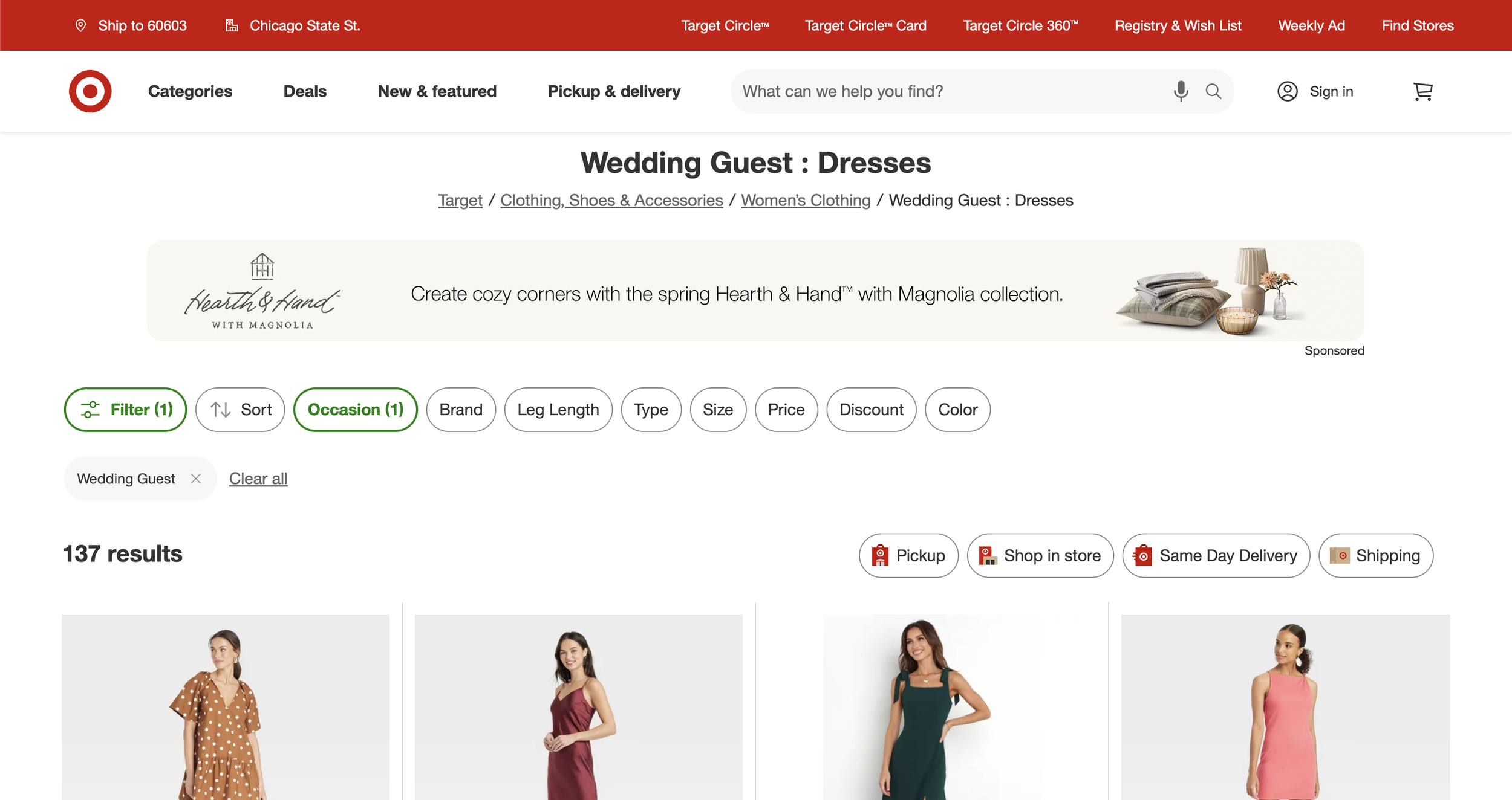
This hypothesis was informed by a combination of internal data analysis, which highlighted the underutilization of the filter and sort features, and competitive research. Brands like Target and Floof Cakes were observed to use a button design with a collapsed filter, which improved product discovery by reducing clutter and making filtering options more accessible. Inspired by this, we redesigned the filter and sort elements to use visible buttons, hoping to enhance the browsing experience, increase user engagement, and drive higher conversion rates and lead generation.
Competitive Analysis: Our goal was to identify examples from competitors or other e-commerce companies where a more prominent button design effectively encouraged visitors to engage with the filter.
Floof Cakes: Uses a button design for filter and sort, making them highly visible and distinct on the page, with dropdowns that open a side panel for easier navigation.
Target: Features a button design for filter and sort options, where the dropdown opens a left-hand panel for easier navigation and selection.
The Test Plan also detailed the following:
Key Metrics:
Lead Events, Adds to Cart, Checkout Starts, Orders
These metrics were tracked to determine if the design change resulted in more conversions and a better user journey.
Supporting Metrics:
PDP Views, Live Chat, Phone Calls, Sample Requests, Virtual Samples, Contact Us
These metrics helped track indirect user engagement, as well as possible friction points in the funnel.
Tracking Approach:
Worked with the analytics team to monitor user behavior with the new filter and sort buttons, focusing on clicks and filter result views.
Phase 2. Design & Development
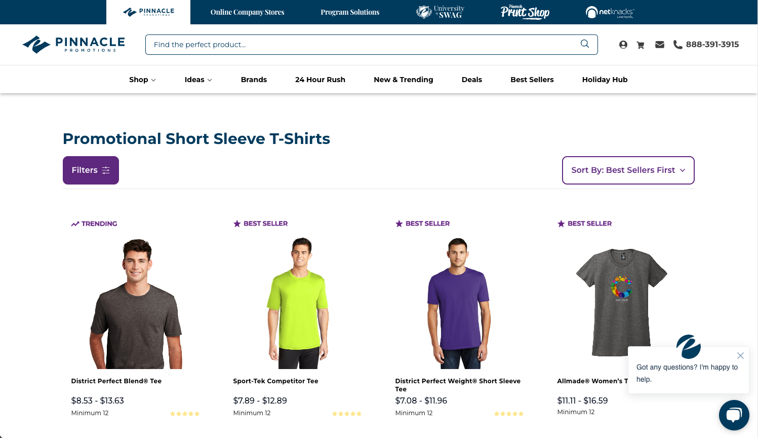
Design Decision: We redesigned the filter and sort options to be more visually prominent by changing them into button-style elements with intuitive icons. This change aimed to make the options easier to identify and interact with.
Filter Button: The filter feature was redesigned as a button to clarify what action would be triggered.
Sort Button: Similarly, the sort option was also redesigned as a button to stand out more.
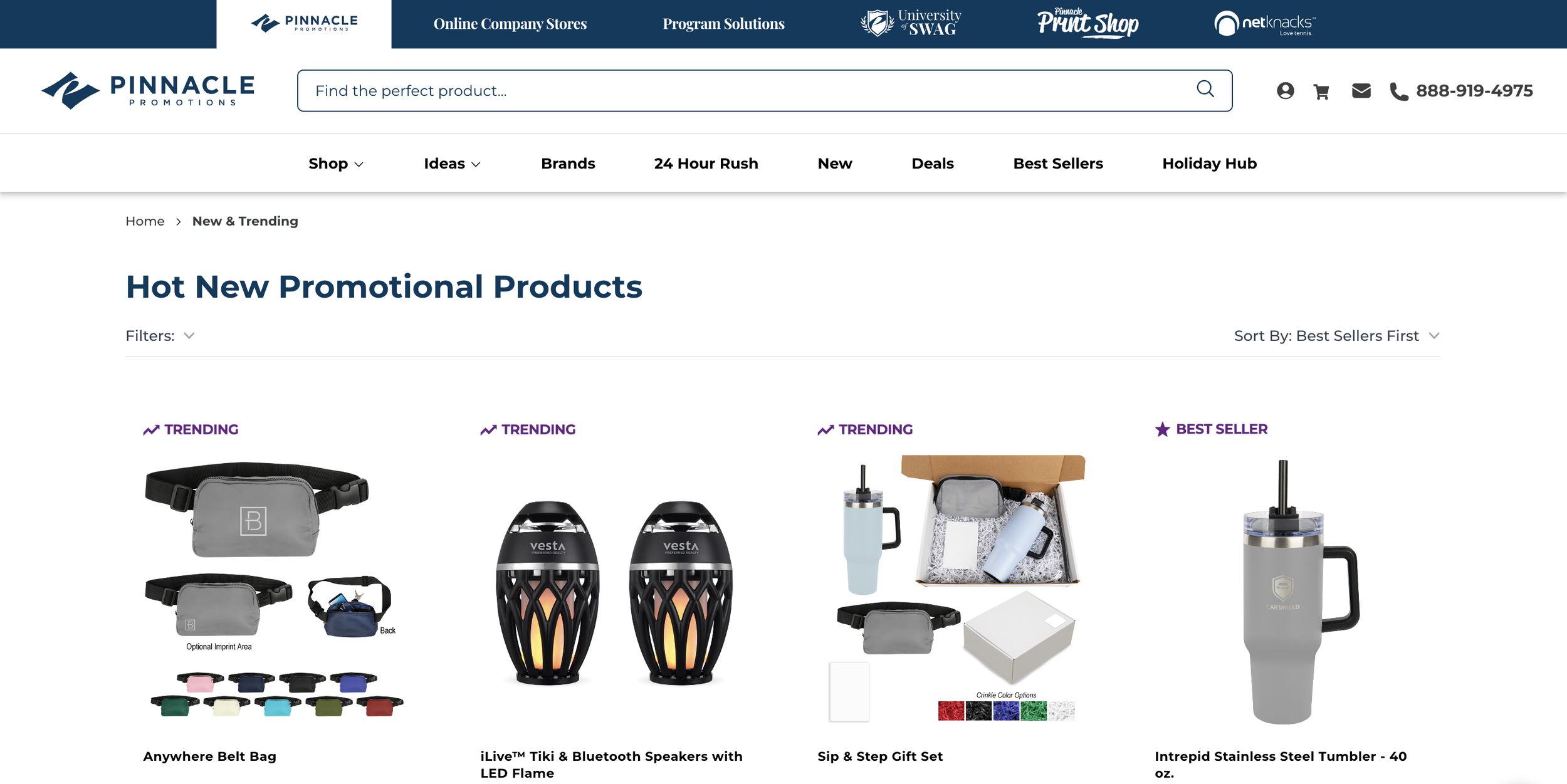
Desktop Control
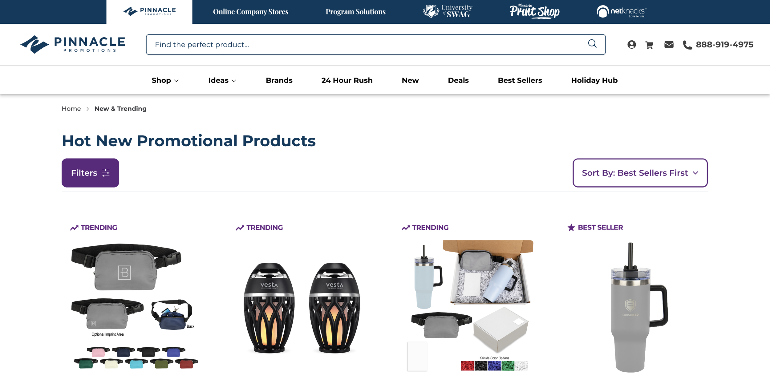
Desktop Variant: Enhanced Filter Visibility
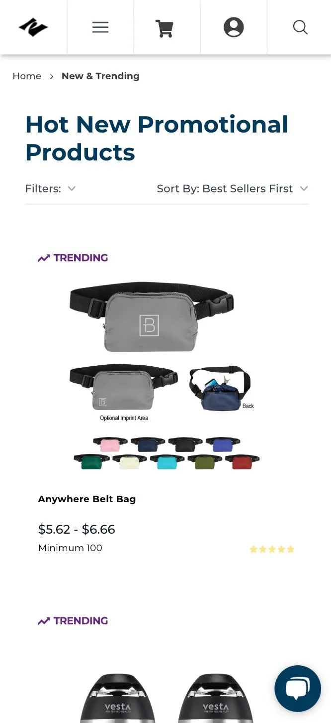
Mobile Control
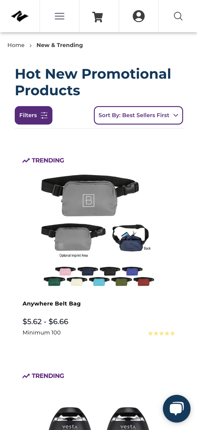
Mobile Variant
Phase 3: Testing
To assess the effectiveness of the redesign, we split traffic into two groups:
Variant 1: The updated design featuring filter and sort options as visible buttons with icons.
Control: The original design with inline text and dropdown indicators.
We tracked key success metrics, including Lead Events, Adds to Cart, Checkout Starts, and Orders to evaluate the impact of the design changes on user behavior and conversions.
Phase 4: Analysis & Results
Analysis: After the test concluded, we compared the performance of the variant with the control group, focusing on lead generation and conversion-related metrics.
Results:
Lead Generation: The variant led to a significant 22% increase in lead generation, confirming that a more visible filter and sort design helped users engage more effectively with the options.
Purchasing Behavior: Users were 18% more likely to use the filter and ultimately became leads.
Checkout and Add to Cart: There was a 24% increase in Adds to Cart and 17% increase in Checkout Starts, indicating higher user engagement with the product listings.
Engagement Rates: Visitors were 38% more likely to open the filter and 25.8% more likely to view the filter results after interacting with the button-style filters.
Additional Insights: Desktop users were more likely to view the filter results (5.3%) compared to mobile users (3.5%), possibly due to the larger screen and the overwhelming number of choices on desktop.
Conclusion & Next Steps
Conclusion: The updated filter and sort button design significantly increased lead generation by improving user interaction with the filtering options. By making the filter and sort elements more prominent, users were more likely to engage with them, which led to a higher likelihood of finding the products they wanted and completing key conversion actions.
Key Learnings:
Visibility Drives Engagement: Making important options like filter and sort more noticeable leads to higher user interaction and more relevant product selection.
Device Behavior Matters: Desktop users engaged with the filters more than mobile users, highlighting the importance of optimizing for device-specific behavior.
Future Testing Recommendations:
Explore different ways of organizing filter options (e.g., by most frequently used, by product category) to further optimize user experience.
Test improvements in the visibility of other key CTAs on the page, such as the "Add to Cart" button, to further drive conversions.